"use client";

import { forwardRef, useCallback, useId, useImperativeHandle, useLayoutEffect, useRef, useState, useSyncExternalStore } from "react";
import type { CSSProperties, HTMLAttributes, KeyboardEvent as ReactKeyboardEvent, ReactNode } from "react";
import { animate, motion, useMotionValue, useReducedMotion } from "motion/react";
import type { Transition } from "motion/react";
import { motionTokens } from "../lib/motion-tokens";
import styles from "./radio-cards.module.css";

export interface RadioCardOption {
  value: string;
  label: ReactNode;
  /** One or two short lines under the label. */
  description?: ReactNode;
  /** A price, estimate, or other value. Sits at the end of a list row, or under the text in a grid card. */
  meta?: ReactNode;
  /** Plain decorative icon beside the label. */
  icon?: ReactNode;
  disabled?: boolean;
  /** Short reason shown in place of the description when the option is disabled. */
  disabledReason?: ReactNode;
}

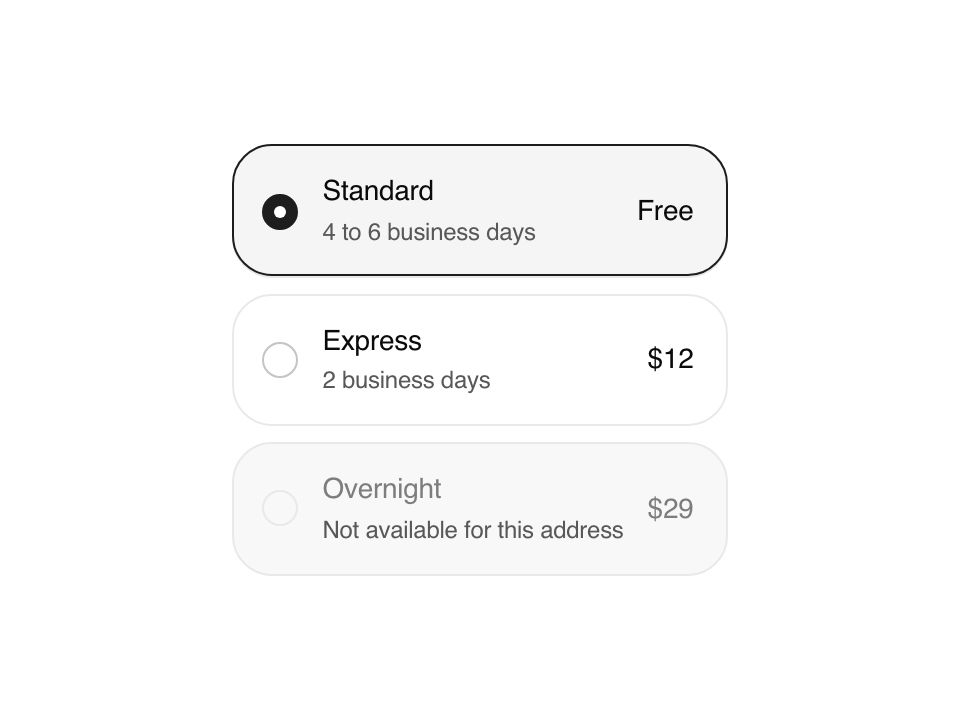
/**
 * Selectable option cards for choices that need more than a label: plans, shipping speeds, regions. One selection ring
 * glides from card to card on a spring, so the eye follows the change. Behaves as a native radio group: one tab stop,
 * arrow keys move and select, and a hidden input carries the value in forms.
 */
export interface RadioCardsProps extends Omit<HTMLAttributes<HTMLDivElement>, "onChange" | "defaultValue"> {
  options: RadioCardOption[];
  value?: string | null;
  defaultValue?: string | null;
  onValueChange?: (value: string) => void;
  /** "grid" places cards in responsive columns; "list" stacks full width rows. */
  layout?: "grid" | "list";
  /** Narrowest a grid column may get before the grid drops a column, in px. */
  minColumnWidth?: number;
  /** Form field name. Renders a hidden input with the selected value. */
  name?: string;
  required?: boolean;
  disabled?: boolean;
}

type Bezier = [number, number, number, number];
const standard = [...motionTokens.ease.standard] as Bezier;
const physical = (visualDuration: number, bounce: number): Transition => {
  const root = 2 * Math.PI / (visualDuration * 1.2);
  return { type: "spring", stiffness: root * root, damping: 2 * (1 - bounce) * root, mass: 1 };
};
const GLIDE = physical(.42, 0);

const subscribe = () => () => {};
function useReducedFlag() {
  const hydrated = useSyncExternalStore(subscribe, () => true, () => false);
  return !!useReducedMotion() && hydrated;
}

export const RadioCards = forwardRef<HTMLDivElement, RadioCardsProps>(function RadioCards({
  options, value, defaultValue = null, onValueChange, layout = "grid", minColumnWidth = 180, name, required, disabled = false, className, style, ...rest
}, forwardedRef) {
  const reduced = useReducedFlag();
  const uid = useId().replace(/[^a-zA-Z0-9_-]/g, "");
  const rootRef = useRef<HTMLDivElement>(null);
  useImperativeHandle(forwardedRef, () => rootRef.current as HTMLDivElement);
  const [internal, setInternal] = useState<string | null>(defaultValue);
  const selected = value !== undefined ? value : internal;
  const selectedIndex = options.findIndex(option => option.value === selected);
  const usable = (option: RadioCardOption) => !disabled && !option.disabled;
  const tabStop = selectedIndex >= 0 && usable(options[selectedIndex]!) ? selectedIndex : options.findIndex(usable);

  const select = (next: string) => {
    if (next === selected) return;
    if (value === undefined) setInternal(next);
    onValueChange?.(next);
  };

  /* The ring: one element that springs to the selected card's box. At rest it follows layout changes exactly. */
  const x = useMotionValue(0), y = useMotionValue(0), w = useMotionValue(0), h = useMotionValue(0), o = useMotionValue(0);
  const placed = useRef(false);
  const place = useCallback((spring: boolean) => {
    const node = selectedIndex < 0 ? null : rootRef.current?.querySelector<HTMLElement>(`[data-card="${selectedIndex}"]`);
    if (!node) { o.set(0); placed.current = false; return; }
    const box: [number, number, number, number] = [node.offsetLeft, node.offsetTop, node.offsetWidth, node.offsetHeight];
    if (!spring || !placed.current || reduced) {
      x.jump(box[0]); y.jump(box[1]); w.jump(box[2]); h.jump(box[3]);
      if (!placed.current && !reduced && spring) { o.jump(0); animate(o, 1, { duration: motionTokens.duration.fast, ease: standard }); } else o.jump(1);
      placed.current = true;
      return;
    }
    animate(x, box[0], GLIDE); animate(y, box[1], GLIDE); animate(w, box[2], GLIDE); animate(h, box[3], GLIDE);
    o.set(1);
  }, [h, o, reduced, selectedIndex, w, x, y]);

  const placeRef = useRef(place);
  useLayoutEffect(() => { placeRef.current = place; place(true); }, [place]);
  // A resize only snaps the ring to the new layout; it never replays the glide.
  useLayoutEffect(() => {
    const root = rootRef.current;
    if (!root || typeof ResizeObserver === "undefined") return;
    const observer = new ResizeObserver(() => placeRef.current(false));
    observer.observe(root);
    return () => observer.disconnect();
  }, []);

  const cards = () => Array.from(rootRef.current?.querySelectorAll<HTMLElement>("[data-card]") ?? []);
  const onKeyDown = (event: ReactKeyboardEvent<HTMLDivElement>, index: number) => {
    const step = event.key === "ArrowRight" || event.key === "ArrowDown" ? 1 : event.key === "ArrowLeft" || event.key === "ArrowUp" ? -1 : 0;
    if (event.key === " " || event.key === "Enter") {
      event.preventDefault();
      if (usable(options[index]!)) select(options[index]!.value);
      return;
    }
    if (!step && event.key !== "Home" && event.key !== "End") return;
    event.preventDefault();
    const count = options.length;
    const rtl = step && (event.key === "ArrowLeft" || event.key === "ArrowRight") && getComputedStyle(event.currentTarget).direction === "rtl" ? -1 : 1;
    let at = event.key === "Home" ? -1 : event.key === "End" ? count : index;
    const dir = event.key === "Home" ? 1 : event.key === "End" ? -1 : step * rtl;
    for (let tries = 0; tries < count; tries++) {
      at = (at + dir + count) % count;
      if (usable(options[at]!)) { cards()[at]?.focus(); select(options[at]!.value); return; }
    }
  };

  return <div ref={rootRef} role="radiogroup" aria-disabled={disabled || undefined} aria-required={required || undefined}
    className={[styles.root, className].filter(Boolean).join(" ")} data-layout={layout}
    style={{ "--min-column": `${minColumnWidth}px`, ...style } as CSSProperties} {...rest}>
    <motion.span className={styles.ring} style={{ x, y, width: w, height: h, opacity: o }} aria-hidden="true" />
    {options.map((option, index) => {
      const checked = index === selectedIndex, off = !usable(option);
      const labelId = `${uid}-${index}-label`, descriptionId = `${uid}-${index}-description`;
      const description = off && option.disabledReason ? option.disabledReason : option.description;
      return <div key={option.value} role="radio" data-card={index} className={styles.card} aria-checked={checked} aria-disabled={off || undefined}
        aria-labelledby={labelId} aria-describedby={description ? descriptionId : undefined} tabIndex={index === tabStop ? 0 : -1}
        data-checked={checked || undefined} onClick={() => { if (!off) select(option.value); }} onKeyDown={event => onKeyDown(event, index)}>
        <span className={styles.indicator} aria-hidden="true">
          <motion.span className={styles.indicatorDot} initial={false} animate={{ scale: checked ? 1 : 0 }} transition={reduced ? { duration: 0 } : motionTokens.spring.snappy} />
        </span>
        <span className={styles.body}>
          <span id={labelId} className={styles.label}>
            {option.icon && <span className={styles.icon}>{option.icon}</span>}
            <span className={styles.labelText}>{option.label}</span>
          </span>
          {description && <span id={descriptionId} className={styles.description}>{description}</span>}
        </span>
        {option.meta && <span className={styles.meta}>{option.meta}</span>}
      </div>;
    })}
    {name && <input type="hidden" name={name} value={selected ?? ""} required={required} />}
  </div>;
});

export default RadioCards;