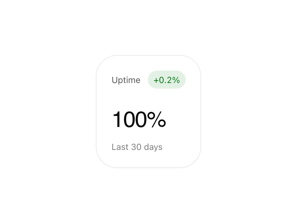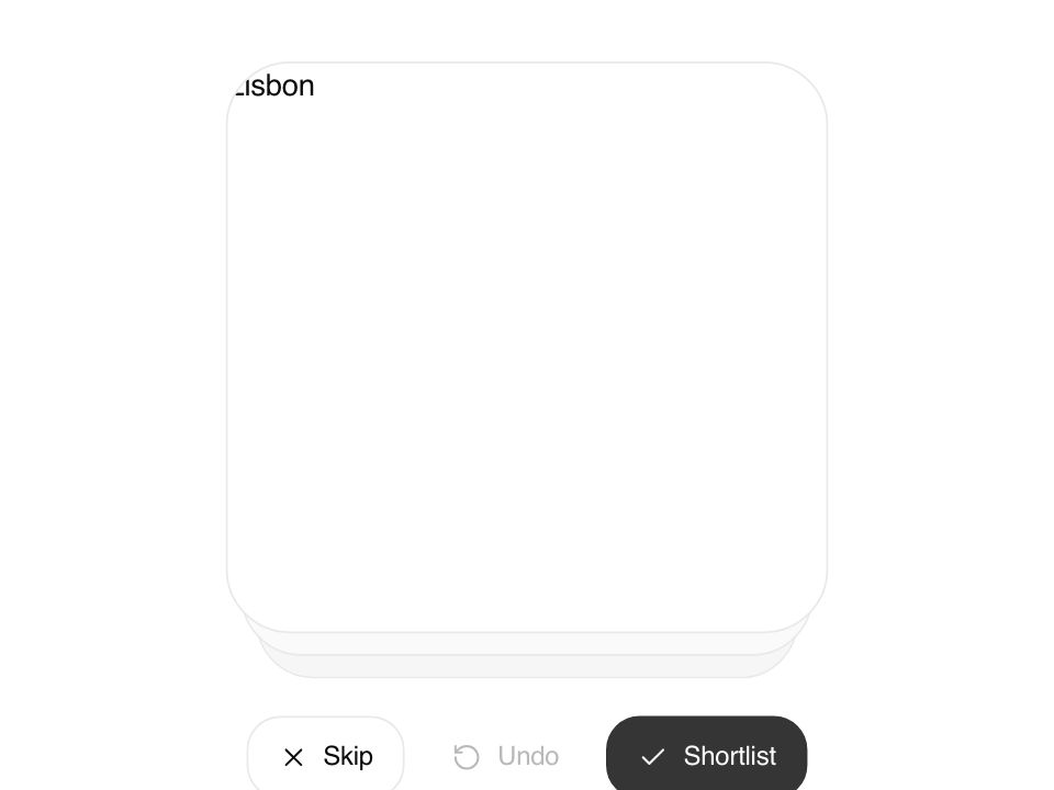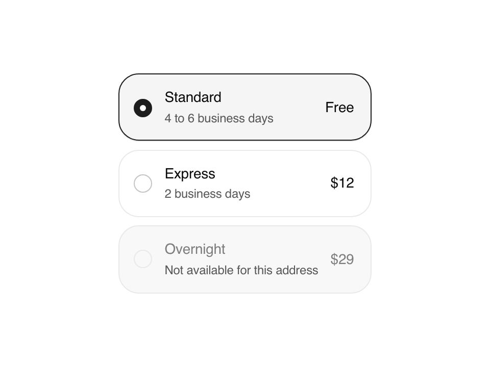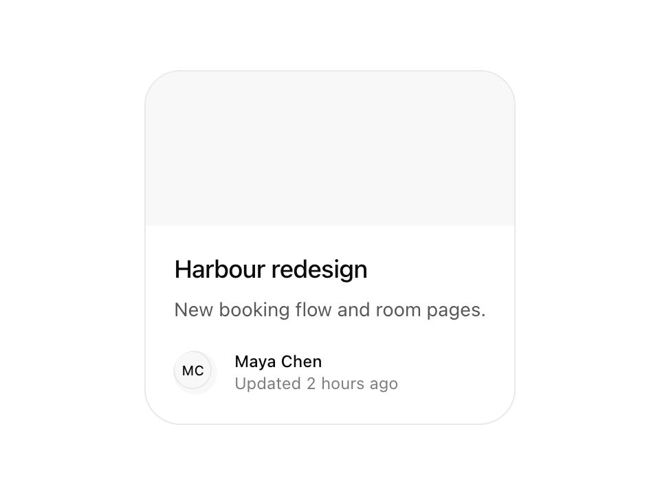
Live component. Click, hover, and type to try it.
Install
npx shadcn@latest add https://uiarc.dev/r/card.jsonAbout
A contained group of related content and actions.
Live component. Click, hover, and type to try it.
npx shadcn@latest add https://uiarc.dev/r/card.jsonA contained group of related content and actions.
"use client";

import * as Dialog from "@radix-ui/react-dialog";
import { useCallback, useEffect, useId, useLayoutEffect, useRef, useState } from "react";
import type { CSSProperties, HTMLAttributes, ReactNode } from "react";
import { AnimatePresence, LayoutGroup, motion, useReducedMotion } from "motion/react";
import type { HTMLMotionProps, MotionProps, Transition, Variants } from "motion/react";
import { X } from "lucide-react";
import { motionTokens } from "../lib/motion-tokens";
import styles from "./card.module.css";

export interface CardProps extends HTMLAttributes<HTMLElement> {
  title: string;
  description?: string;
  media?: ReactNode;
  action?: ReactNode;
  /** A small leading visual for the footer, such as the owner's avatar. */
  avatar?: ReactNode;
  /** Who the card belongs to, such as the owner's name. */
  meta?: ReactNode;
  /** A short status under the meta, such as "Updated 2 hours ago". Changed words rise in and are announced politely. */
  status?: string;
  /** Content for a quick look. When set, the whole card opens and grows into a larger view; Escape or the close control morphs it back. */
  details?: ReactNode;
  open?: boolean;
  defaultOpen?: boolean;
  onOpenChange?: (open: boolean) => void;
}

type Side = "card" | "panel";
type Geometry = { card?: number; panel?: number; measure?: number };
type Landing = { top: number; left: number; width: number; height: number };

const { blur, duration, ease, spring, stagger } = motionTokens;
/** One critically damped spring carries the surface both ways, so it never overshoots and can reverse mid-flight. Closing is a touch quicker. */
const grow: Transition = { ...spring.smooth, visualDuration: .3 };
const settle: Transition = { ...spring.smooth, visualDuration: .26 };
const RETURN_MS = 300;
const fade: Transition = { duration: duration.instant };
/** The photo drifts in slowly while the card is pointed at, and eases back a little faster. */
const ZOOM = 1.04;
const zoomIn: Transition = { duration: duration.considered * 2, ease: [...ease.standard] };
const zoomOut: Transition = { duration: duration.considered, ease: [...ease.standard] };
/** Quick look extras arrive once the surface has mostly grown, so they never ride the stretch. */
const reveal: Transition = { delay: duration.instant, duration: duration.standard, ease: [...ease.enter] };
const closeIn: Transition = { delay: duration.instant, duration: duration.fast, ease: [...ease.enter] };

/** A new status replaces the whole line: the old one lifts away quickly while the new words rise in one after another. */
const lineMotion: Variants = {
  enter: {},
  center: {},
  exit: { opacity: 0, y: "-.3em", filter: `blur(${blur.subtle}px)`, transition: { duration: duration.fast, ease: [...ease.standard] } },
};
const wordMotion: Variants = {
  enter: { opacity: 0, y: ".3em", filter: `blur(${blur.soft}px)` },
  center: (order: number) => ({ opacity: 1, y: 0, filter: "blur(0px)", transition: { duration: duration.standard, ease: [...ease.enter], delay: order * stagger.word } }),
};

function Status({ text, reduced }: { text: string; reduced: boolean }) {
  return <span className={styles.status} role="status">
    <span className={styles.srOnly}>{text}</span>
    <span className={styles.roll} aria-hidden="true"><AnimatePresence mode="popLayout" initial={false}>
      <motion.span key={text} className={styles.line} variants={lineMotion} initial={reduced ? false : "enter"} animate="center" exit={reduced ? undefined : "exit"}>
        {text.split(/(\s+)/).map((part, index) => <motion.span key={index} className={styles.word} custom={index / 2} variants={wordMotion}>{part}</motion.span>)}
      </motion.span>
    </AnimatePresence></span>
  </span>;
}

/** Motion only scale-corrects pixel radii, so token radii are read back in pixels for the morph. */
function px(node: Element, value: string) {
  const amount = parseFloat(value);
  if (!Number.isFinite(amount)) return undefined;
  return value.trim().endsWith("rem") ? amount * parseFloat(getComputedStyle(node.ownerDocument.documentElement).fontSize) : amount;
}

export function Card({ title, description, media, action, avatar, meta, status, details, open: openProp, defaultOpen = false, onOpenChange, children, className, style, ...props }: CardProps) {
  const reduced = useReducedMotion() ?? false;
  const group = useId();
  const cardRef = useRef<HTMLElement>(null);
  const descriptionRef = useRef<HTMLParagraphElement>(null);
  const [uncontrolled, setUncontrolled] = useState(defaultOpen);
  const [hovered, setHovered] = useState(false);
  const [geometry, setGeometry] = useState<Geometry>({});
  /** Where the quick look lands when it closes: the card's box on screen. The panel travels there above the page, then hands back to the card. */
  const [landing, setLanding] = useState<Landing | null>(null);
  const open = details ? openProp ?? uncontrolled : false;
  const morph = Boolean(details) && !reduced;
  const returning = !open && landing !== null;
  const hasDescription = Boolean(description);
  const setOpen = useCallback((next: boolean) => { if (openProp === undefined) setUncontrolled(next); onOpenChange?.(next); }, [openProp, onOpenChange]);

  // The quick look keeps the card's line length, so the description never rewraps while it travels.
  useEffect(() => {
    const node = cardRef.current, text = descriptionRef.current;
    if (!morph || !node || typeof ResizeObserver === "undefined") return;
    const observer = new ResizeObserver(() => {
      const computed = getComputedStyle(node);
      const radius = px(node, computed.borderTopLeftRadius), surface = px(node, computed.getPropertyValue("--radius-surface")), measure = text?.offsetWidth || undefined;
      setGeometry(current => current.card !== undefined && current.measure === measure ? current : { card: current.card ?? radius, panel: current.panel ?? surface, measure });
    });
    observer.observe(node);
    if (text) observer.observe(text);
    return () => observer.disconnect();
  }, [morph, hasDescription]);

  // Closing keeps the quick look mounted and sends it back to the card's box, so the surface never drops behind the page or a clipped preview.
  const wasOpen = useRef(open);
  useLayoutEffect(() => {
    const closed = wasOpen.current && !open;
    wasOpen.current = open;
    const node = cardRef.current;
    if (open) setLanding(null); // eslint-disable-line react-hooks/set-state-in-effect -- reopening mid-return cancels the landing
    else if (closed && morph && node) {
      const box = node.getBoundingClientRect();
      setLanding({ top: box.top, left: box.left, width: box.width, height: box.height });
    }
  }, [open, morph]);
  // Once the surface has visually landed, the card takes over. Any last sub-pixel of travel carries on in the card itself, so the handoff has no seam.
  useEffect(() => {
    if (!returning) return;
    const timer = window.setTimeout(() => setLanding(null), RETURN_MS);
    return () => window.clearTimeout(timer);
  }, [returning]);

  /** The same pieces live in the card and in the quick look; a shared id lets each one travel between them.
      Crossfade is off: the arriving piece takes over at full opacity and the other hides, so one solid surface moves instead of two translucent copies. */
  const shared = (id: string, side: Side, layout: true | "position" = true): MotionProps => morph ? { layoutId: id, layout, layoutCrossfade: false, layoutDependency: side === "card" ? open : returning ? "return" : "panel", transition: { layout: side === "card" ? settle : grow } } : {};

  const footer = (side: Side) => avatar || meta || status || action ? <div className={styles.footer}>
    {avatar || meta || status ? <motion.div className={styles.byline} {...shared("byline", side, "position")}>
      {avatar ? <span className={styles.avatar}>{avatar}</span> : null}
      <span className={styles.bylineText}>{meta ? <span className={styles.meta}>{meta}</span> : null}{status ? <Status text={status} reduced={reduced} /> : null}</span>
    </motion.div> : null}
    {action ? <motion.div className={styles.action} {...shared("action", side, "position")}>{action}</motion.div> : null}
  </div> : null;

  const card = <motion.article
    {...(props as HTMLMotionProps<"article">)}
    ref={cardRef}
    className={[styles.card, className].filter(Boolean).join(" ")}
    style={{ ...style, borderRadius: geometry.card ?? style?.borderRadius }}
    data-hover={hovered || undefined}
    whileHover={reduced ? undefined : { y: -2 }}
    onHoverStart={() => setHovered(true)}
    onHoverEnd={() => setHovered(false)}
    {...shared("card", "card")}
    transition={{ default: spring.snappy, layout: settle }}
  >
    {media ? <motion.div className={styles.media} {...shared("media", "card")}><motion.div className={styles.zoom} initial={false} animate={{ scale: hovered && !reduced ? ZOOM : 1 }} transition={hovered ? zoomIn : zoomOut}>{media}</motion.div></motion.div> : null}
    <div className={styles.content}>
      <motion.h3 className={styles.title} {...shared("title", "card")}>{details ? <Dialog.Trigger asChild><button type="button" className={styles.trigger}>{title}</button></Dialog.Trigger> : title}</motion.h3>
      {description ? <motion.p ref={descriptionRef} className={styles.description} {...shared("description", "card", "position")}>{description}</motion.p> : null}
      {children}
      {footer("card")}
    </div>
  </motion.article>;

  if (!details) return card;

  // The quick look grows out of the card: the surface, photo, and copy travel on one spring while the details settle in beneath them.
  return <Dialog.Root open={open} onOpenChange={setOpen}>
    <LayoutGroup id={group}>
      {card}
      <AnimatePresence>
        {(open || returning) && <Dialog.Portal key="quick-look" forceMount>
          <AnimatePresence>{open && <Dialog.Overlay key="overlay" asChild forceMount><motion.div className={styles.overlay} initial={{ opacity: 0 }} animate={{ opacity: 1 }} exit={{ opacity: 0, transition: reduced ? fade : { duration: duration.exit, ease: [...ease.standard] } }} transition={reduced ? fade : { duration: duration.standard, ease: [...ease.enter] }} /></Dialog.Overlay>}</AnimatePresence>
          <Dialog.Content asChild forceMount {...(description ? {} : { "aria-describedby": undefined })}>
            <motion.div
              className={styles.panel}
              data-framer-portal-id={group}
              data-returning={returning || undefined}
              layoutScroll
              style={{ borderRadius: geometry.panel, "--card-measure": geometry.measure ? `${geometry.measure}px` : undefined, ...(landing && returning ? { "--landing-top": `${landing.top}px`, "--landing-left": `${landing.left}px`, "--landing-width": `${landing.width}px`, "--landing-height": `${landing.height}px` } : {}) } as CSSProperties}
              {...(morph ? {
                ...shared("card", "panel"),
                initial: false,
                animate: geometry.card !== undefined && geometry.panel !== undefined ? { borderRadius: returning ? geometry.card : geometry.panel } : undefined,
                transition: { layout: returning ? settle : grow, borderRadius: returning ? settle : grow },
                exit: { opacity: 0, transition: { duration: 0 } },
              } : { initial: { opacity: 0 }, animate: { opacity: 1 }, exit: { opacity: 0, transition: fade }, transition: fade })}
            >
              {media ? <motion.div className={styles.media} {...shared("media", "panel")}><motion.div className={styles.zoom} initial={{ scale: hovered && !reduced ? ZOOM : 1 }} animate={{ scale: 1 }} transition={grow}>{media}</motion.div></motion.div> : null}
              <motion.span className={styles.closeSlot} initial={reduced ? { opacity: 0 } : { opacity: 0, scale: .9 }} animate={returning ? { opacity: 0, scale: .9 } : { opacity: 1, scale: 1 }} transition={returning ? fade : reduced ? fade : closeIn}><Dialog.Close asChild><motion.button type="button" className={styles.close} aria-label="Close quick look" whileTap={reduced ? undefined : { scale: .94 }} transition={spring.snappy}><X width={16} height={16} strokeWidth={1.75} aria-hidden="true" /></motion.button></Dialog.Close></motion.span>
              <div className={styles.content}>
                <Dialog.Title asChild><motion.h2 className={styles.title} {...shared("title", "panel")}>{title}</motion.h2></Dialog.Title>
                {description ? <Dialog.Description asChild><motion.p className={styles.description} {...shared("description", "panel", "position")}>{description}</motion.p></Dialog.Description> : null}
                {children}
                {footer("panel")}
                <motion.div className={styles.details} initial={reduced ? false : { opacity: 0, y: 6 }} animate={returning ? { opacity: 0, y: 0 } : { opacity: 1, y: 0 }} exit={{ opacity: 0, transition: fade }} transition={returning || reduced ? fade : reveal}>{details}</motion.div>
              </div>
            </motion.div>
          </Dialog.Content>
        </Dialog.Portal>}
      </AnimatePresence>
    </LayoutGroup>
  </Dialog.Root>;
}