Hold to confirmNew
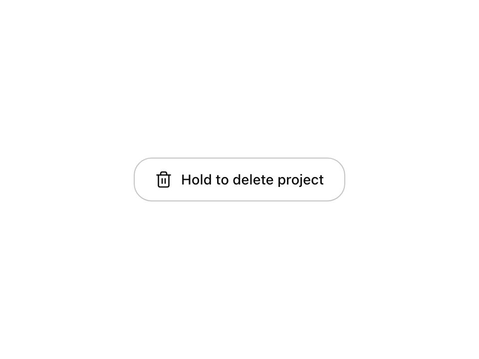
Live component. Click, hover, and type to try it.
Install
npx shadcn@latest add https://uiarc.dev/r/hold-to-confirm.jsonAbout
Confirm a destructive action by holding, not tapping.
Live component. Click, hover, and type to try it.
npx shadcn@latest add https://uiarc.dev/r/hold-to-confirm.jsonConfirm a destructive action by holding, not tapping.
"use client";

import { useEffect, useEffectEvent, useId, useRef, useState } from "react";
import type { ButtonHTMLAttributes, KeyboardEvent as ReactKeyboardEvent, PointerEvent as ReactPointerEvent, ReactNode } from "react";
import { AnimatePresence, animate, motion, useMotionValue, useReducedMotion, useTransform } from "motion/react";
import type { AnimationPlaybackControls, MotionValue, TargetAndTransition } from "motion/react";
import { Trash2 } from "lucide-react";
import { motionTokens } from "../lib/motion-tokens";
import styles from "./hold-to-confirm.module.css";

/**
 * A button that commits only after it is held, for destructive or hard to undo actions where a stray tap must not count. A fill tracks the hold on a
 * linear timeline; letting go early rewinds it on a spring, and finishing morphs the label and icon into a done state. Space and Enter can be held too.
 * Prefer a regular confirmation dialog when people need to read consequences first; use this when the consequence is already on screen.
 */
export interface HoldToConfirmProps extends Omit<ButtonHTMLAttributes<HTMLButtonElement>, "children" | "onClick" | "onDrag" | "onDragEnd" | "onDragStart" | "onAnimationStart" | "onAnimationEnd"> {
  /** The instruction and the action, for example “Hold to delete project”. */
  label: string;
  /** Shown once the hold completes, for example “Deleted”. */
  confirmedLabel?: string;
  /** Called once when the hold completes. */
  onConfirm: () => void;
  /** Hold length in milliseconds. */
  duration?: number;
  icon?: ReactNode;
  /** `accent` (default) fills with the selected accent; `danger` is for an irreversible action; `neutral` fills with the foreground. */
  tone?: "accent" | "danger" | "neutral";
  /** Controls the done state. Set it back to false to reset the button; leave it undefined to let the button keep its own state. */
  confirmed?: boolean;
  /** Reports when a hold starts and ends, for surrounding hints such as “Keep holding”. */
  onHoldChange?: (holding: boolean) => void;
}

const enter = [...motionTokens.ease.enter] as [number, number, number, number];
const standard = [...motionTokens.ease.standard] as [number, number, number, number];
const rest: TargetAndTransition = { opacity: 1, y: 0, scale: 1, filter: "blur(0px)" };
const textIn: TargetAndTransition = { opacity: 0, y: "0.3em", filter: `blur(${motionTokens.blur.soft}px)` };
const textOut: TargetAndTransition = { opacity: 0, y: "-0.3em", filter: `blur(${motionTokens.blur.subtle}px)`, transition: { duration: motionTokens.duration.fast, ease: standard } };
const iconIn: TargetAndTransition = { opacity: 0, scale: .6, filter: `blur(${motionTokens.blur.subtle}px)` };
const iconOut: TargetAndTransition = { ...iconIn, transition: { duration: motionTokens.duration.fast, ease: standard } };
const fadeIn: TargetAndTransition = { opacity: 0 };
const fadeOut: TargetAndTransition = { opacity: 0, transition: { duration: motionTokens.duration.instant } };
/** Scale rides the spring; opacity and blur tween so the blur never overshoots below zero. */
const iconEnter = { ...motionTokens.spring.snappy, opacity: { duration: motionTokens.duration.fast, ease: enter }, filter: { duration: motionTokens.duration.fast, ease: enter } };

/** The tick draws itself from its short stroke, the way a hand would write it. */
function DrawnCheck({ reduced }: { reduced: boolean }) {
  return <svg width={18} height={18} viewBox="0 0 24 24" fill="none" stroke="currentColor" strokeWidth={2} strokeLinecap="round" strokeLinejoin="round" aria-hidden="true">
    <motion.path d="M4 12.5l5 5L20 6.5" initial={reduced ? false : { pathLength: 0, opacity: 0 }} animate={{ pathLength: 1, opacity: 1 }} transition={{ pathLength: { duration: .32, ease: enter, delay: .08 }, opacity: { duration: .05, delay: .08 } }} />
  </svg>;
}

type FaceProps = { icon: ReactNode; text: string; done: boolean; width: MotionValue<number | "auto">; reduced: boolean; measure?: (node: HTMLSpanElement | null) => void };

/** Icon and label. The button renders it twice: once on the surface and once inside the fill, so the text changes colour exactly at the fill edge. */
function Face({ icon, text, done, width, reduced, measure }: FaceProps) {
  return <span className={styles.face}>
    <span className={styles.iconSlot}>
      <AnimatePresence initial={false}>
        <motion.span key={done ? "done" : "idle"} className={styles.iconPhase} initial={reduced ? fadeIn : iconIn} animate={rest} exit={reduced ? fadeOut : iconOut} transition={reduced ? { duration: motionTokens.duration.fast } : iconEnter}>
          {done ? <DrawnCheck reduced={reduced} /> : icon}
        </motion.span>
      </AnimatePresence>
    </span>
    <motion.span className={styles.labelFrame} style={{ width }}>
      {measure && <span ref={measure} className={styles.measure}>{text}</span>}
      <AnimatePresence mode="popLayout" initial={false}>
        <motion.span key={text} className={styles.label} initial={reduced ? fadeIn : textIn} animate={rest} exit={reduced ? fadeOut : textOut} transition={{ duration: reduced ? motionTokens.duration.fast : motionTokens.duration.standard, ease: enter }}>{text}</motion.span>
      </AnimatePresence>
    </motion.span>
  </span>;
}

/** Springs the label frame to the width of new text, so the button morphs instead of snapping. A late web font or a reflow follows instantly. */
function useLabelWidth(reduced: boolean) {
  const width = useMotionValue<number | "auto">("auto");
  const [node, setNode] = useState<HTMLSpanElement | null>(null);
  useEffect(() => {
    if (!node || typeof ResizeObserver === "undefined") return;
    let lastText: string | null = null;
    let sizing: AnimationPlaybackControls | null = null;
    const observer = new ResizeObserver(([entry]) => {
      // Layout width, not the painted box: the done label is measured while the pressed button is still scaled down.
      const next = entry?.borderBoxSize?.[0]?.inlineSize ?? node.offsetWidth;
      const text = node.textContent;
      const morph = lastText !== null && lastText !== text && !reduced && typeof width.get() === "number";
      lastText = text;
      sizing?.stop();
      if (morph) sizing = animate(width, next, motionTokens.spring.morph);
      else width.jump(next);
    });
    observer.observe(node);
    return () => { observer.disconnect(); sizing?.stop(); };
  }, [node, reduced, width]);
  return [width, setNode] as const;
}

export function HoldToConfirm({ label, confirmedLabel = "Done", onConfirm, duration = 1200, icon = <Trash2 strokeWidth={1.75} />, tone = "accent", confirmed, onHoldChange, className, disabled, ...props }: HoldToConfirmProps) {
  const reduced = useReducedMotion() ?? false;
  const hintId = useId();
  const [ownDone, setOwnDone] = useState(false);
  const [completions, setCompletions] = useState(0);
  const done = confirmed ?? ownDone;
  const [holding, setHolding] = useState(false);
  const progress = useMotionValue(0);
  const scale = useMotionValue(1);
  const clipPath = useTransform(progress, value => `inset(0 ${((1 - Math.min(1, Math.max(0, value))) * 100).toFixed(3)}% 0 0)`);
  const [width, measure] = useLabelWidth(reduced);
  const source = useRef<"pointer" | "key" | null>(null);
  const pointerType = useRef("mouse");
  const fill = useRef<AnimationPlaybackControls | null>(null);
  const press = useRef<AnimationPlaybackControls | null>(null);
  const button = useRef<HTMLButtonElement>(null);
  const text = done ? confirmedLabel : label;
  const seconds = (duration / 1000).toLocaleString("en-US", { maximumFractionDigits: 1 });

  function pressTo(pressed: boolean) {
    press.current?.stop();
    if (reduced) { scale.jump(1); return; }
    const depth = (button.current?.offsetWidth ?? 0) > 220 ? .985 : .97;
    press.current = animate(scale, pressed ? depth : 1, motionTokens.spring.snappy);
  }

  function rewind() {
    fill.current?.stop();
    if (reduced) progress.jump(0);
    else fill.current = animate(progress, 0, { ...motionTokens.spring.smooth, velocity: 0 });
  }

  function stopHolding() {
    source.current = null;
    setHolding(false);
    onHoldChange?.(false);
    pressTo(false);
  }

  function complete() {
    if (!source.current) return;
    stopHolding();
    if (pointerType.current === "touch") navigator.vibrate?.(12);
    setOwnDone(true);
    setCompletions(count => count + 1);
    onConfirm();
  }

  /** Starts or resumes the fill from wherever it is, so a quick re-press after letting go carries on instead of starting over. */
  function begin(from: "pointer" | "key") {
    if (done || disabled || source.current) return;
    source.current = from;
    setHolding(true);
    onHoldChange?.(true);
    pressTo(true);
    fill.current?.stop();
    fill.current = animate(progress, 1, { duration: (1 - progress.get()) * duration / 1000, ease: "linear", onComplete: complete });
  }

  function release() {
    if (!source.current) return;
    stopHolding();
    rewind();
  }

  // A reset rewinds the fill as the label morphs back; a confirmation the parent declined rewinds too.
  const syncFill = useEffectEvent(() => {
    if (done && progress.get() < 1 && !source.current) { fill.current?.stop(); if (reduced) progress.jump(1); else fill.current = animate(progress, 1, motionTokens.spring.smooth); }
    if (!done && progress.get() > 0 && !source.current) rewind();
  });
  useEffect(() => { syncFill(); }, [done, completions]);
  useEffect(() => () => { fill.current?.stop(); press.current?.stop(); }, []);

  function onPointerDown(event: ReactPointerEvent<HTMLButtonElement>) {
    if (!event.isPrimary || event.button !== 0) return;
    pointerType.current = event.pointerType;
    event.currentTarget.setPointerCapture(event.pointerId);
    begin("pointer");
  }
  function onPointerMove(event: ReactPointerEvent<HTMLButtonElement>) {
    if (source.current !== "pointer") return;
    // Sliding well off the button cancels, the way a native press does.
    const box = event.currentTarget.getBoundingClientRect(), slack = 24;
    if (event.clientX < box.left - slack || event.clientX > box.right + slack || event.clientY < box.top - slack || event.clientY > box.bottom + slack) release();
  }
  function onKeyDown(event: ReactKeyboardEvent<HTMLButtonElement>) {
    if (event.key !== " " && event.key !== "Enter") return;
    event.preventDefault();
    if (!event.repeat) begin("key");
  }
  function onKeyUp(event: ReactKeyboardEvent<HTMLButtonElement>) {
    if (event.key !== " " && event.key !== "Enter") return;
    event.preventDefault();
    if (source.current === "key") release();
  }

  return <>
    <motion.button {...props} ref={button} type="button" className={[styles.button, className].filter(Boolean).join(" ")} data-tone={tone} data-state={done ? "done" : holding ? "holding" : "idle"}
      disabled={disabled} aria-disabled={done || undefined} aria-label={text} aria-describedby={done ? undefined : hintId} style={{ scale }}
      onPointerDown={onPointerDown} onPointerMove={onPointerMove} onPointerUp={release} onPointerCancel={release} onLostPointerCapture={release}
      onKeyDown={onKeyDown} onKeyUp={onKeyUp} onBlur={release} onContextMenu={event => event.preventDefault()}>
      <Face icon={icon} text={text} done={done} width={width} reduced={reduced} measure={measure} />
      <motion.span className={styles.fill} style={{ clipPath }} aria-hidden="true">
        <Face icon={icon} text={text} done={done} width={width} reduced={reduced} />
      </motion.span>
    </motion.button>
    <span id={hintId} className={styles.srOnly}>{`Press and hold for ${seconds} seconds to confirm. With a keyboard, hold Space or Enter.`}</span>
    <span className={styles.srOnly} role="status">{done ? confirmedLabel : ""}</span>
  </>;
}

export default HoldToConfirm;