Expandable cardNew
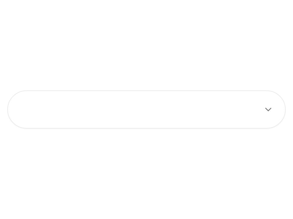
Live component. Click, hover, and type to try it.
Install
npx shadcn@latest add https://uiarc.dev/r/expandable-card.jsonAbout
Give a dense card more room when requested.
Live component. Click, hover, and type to try it.
npx shadcn@latest add https://uiarc.dev/r/expandable-card.jsonGive a dense card more room when requested.
"use client";

import { useId, useLayoutEffect, useRef, useState } from "react";
import type { ComponentPropsWithoutRef, CSSProperties, KeyboardEvent, ReactNode } from "react";
import { AnimatePresence, animate, motion, useMotionValue, useReducedMotion } from "motion/react";
import type { Transition, Variants } from "motion/react";
import { ChevronDown as NavArrowDown } from "lucide-react";
import { motionTokens } from "../lib/motion-tokens";
import styles from "./expandable-card.module.css";

export interface ExpandableCardProps extends Omit<ComponentPropsWithoutRef<"article">, "title" | "children" | "onAnimationStart" | "onAnimationEnd" | "onAnimationIteration" | "onDrag" | "onDragStart" | "onDragEnd" | "onDragOver" | "onDragLeave" | "onDragEnter" | "onDragExit" | "onDrop"> {
  title: string;
  description?: string;
  children: ReactNode;
  defaultExpanded?: boolean;
  /** Collapsed width cap in px. The card is centered and never wider than its container. Fills the container when omitted. */
  width?: number;
  /** Expanded width cap in px, so the card can grow sideways into more room. Defaults to `width`. */
  expandedWidth?: number;
}

/**
 * One morph: the box grows in width and height on the same spring, which never overshoots, so close is the exact mirror of open.
 * Size is animated for real (not with a scale), so the text, border, and corner radius never stretch.
 */
const morph = motionTokens.spring.smooth;
/** On close the details fade out first, then the box starts to shrink; on open they fade in once the box has made room. */
const closeHold = 0.06;
/** A close that reverses an open still in flight skips the hold, so the spring turns around with its velocity instead of stalling. */
const settleTime = 450;
const boxTransition = (expanded: boolean, hold: boolean): Transition => expanded || !hold ? morph : { ...morph, delay: closeHold };
const contentTransition = (expanded: boolean): Transition => expanded
  ? { duration: motionTokens.duration.standard, ease: [...motionTokens.ease.standard], delay: 0.12 }
  : { duration: 0.1, ease: [...motionTokens.ease.standard] };
const still: Transition = { duration: 0 };

/** Changed words in the summary rise in; unchanged words hold still. */
const wordMotion: Variants = {
  enter: { opacity: 0, y: ".35em", filter: `blur(${motionTokens.blur.soft}px)` },
  center: { opacity: 1, y: 0, filter: "blur(0px)", transition: { duration: motionTokens.duration.standard, ease: [...motionTokens.ease.enter] } },
  exit: { opacity: 0, y: "-.3em", filter: `blur(${motionTokens.blur.subtle}px)`, transition: { duration: motionTokens.duration.fast, ease: [...motionTokens.ease.standard] } },
};

function RollingText({ text, reduced }: { text: string; reduced: boolean }) {
  return <span className={styles.roll}>
    <span className={styles.srOnly}>{text}</span>
    <span aria-hidden="true"><AnimatePresence mode="popLayout" initial={false}>
      {text.split(/(\s+)/).map((word, index) => <motion.span key={`${index}:${word}`} className={styles.word} variants={wordMotion} initial={reduced ? false : "enter"} animate="center" exit={reduced ? undefined : "exit"}>{word}</motion.span>)}
    </AnimatePresence></span>
  </span>;
}

export function ExpandableCard({ title, description, children, defaultExpanded = false, width, expandedWidth, className, style, onKeyDown, ...rest }: ExpandableCardProps) {
  const [expanded, setExpanded] = useState(defaultExpanded);
  const [hold, setHold] = useState(true);
  const lastToggle = useRef(0);
  // The room the card can use, measured from its centering track. Until it is known, CSS caps the width.
  const [room, setRoom] = useState<number | null>(null);
  const trackRef = useRef<HTMLDivElement>(null);
  const triggerRef = useRef<HTMLButtonElement>(null);
  const panelId = useId();
  const reduceMotion = useReducedMotion() ?? false;

  useLayoutEffect(() => {
    const track = trackRef.current;
    if (!track) return;
    const measure = () => setRoom(track.clientWidth);
    measure();
    const observer = new ResizeObserver(measure);
    observer.observe(track);
    return () => observer.disconnect();
  }, []);

  const openCap = expandedWidth ?? width;
  const fit = (cap: number | undefined) => room === null ? undefined : Math.min(room, cap ?? room);
  const boxWidth = fit(expanded ? openCap : width);
  // The details are laid out at their final width the whole time, so nothing reflows while the box changes size.
  const innerWidth = fit(openCap);

  // The width lives in a motion value: the first measurement lands without motion, later changes spring from the current width and velocity.
  const boxWidthValue = useMotionValue<number | string>("100%");
  const placed = useRef(false);
  const widthTransition = reduceMotion ? still : boxTransition(expanded, hold);
  useLayoutEffect(() => {
    if (boxWidth === undefined) return;
    if (!placed.current) { placed.current = true; boxWidthValue.jump(boxWidth); return; }
    const controls = animate(boxWidthValue, boxWidth, widthTransition);
    return () => controls.stop();
  }, [boxWidth, boxWidthValue]); // eslint-disable-line react-hooks/exhaustive-deps

  // Caps for the first paint, before the room is measured.
  const capVars = { "--expandable-card-width": width ? `${width}px` : undefined, "--expandable-card-expanded-width": openCap ? `${openCap}px` : undefined } as CSSProperties;

  const toggle = (next: boolean) => {
    const now = performance.now();
    setHold(now - lastToggle.current > settleTime);
    lastToggle.current = now;
    setExpanded(next);
  };
  const handleKeyDown = (event: KeyboardEvent<HTMLElement>) => {
    onKeyDown?.(event);
    if (event.defaultPrevented || event.key !== "Escape" || !expanded) return;
    event.preventDefault();
    toggle(false);
    triggerRef.current?.focus();
  };

  return <div ref={trackRef} className={styles.track}>
    <motion.article
      {...rest}
      className={[styles.card, className].filter(Boolean).join(" ")}
      data-expanded={expanded}
      data-measured={room === null ? undefined : ""}
      style={{ ...style, ...capVars, width: boxWidthValue }}
      onKeyDown={handleKeyDown}
    >
      <button ref={triggerRef} type="button" className={styles.trigger} aria-expanded={expanded} aria-controls={panelId} onClick={() => toggle(!expanded)}>
        <span className={styles.copy}><strong>{title}</strong>{description && <span className={styles.description}><RollingText text={description} reduced={reduceMotion} /></span>}</span>
        <motion.span className={styles.arrow} initial={false} animate={{ rotate: expanded ? 180 : 0 }} transition={reduceMotion ? still : boxTransition(expanded, hold)}><NavArrowDown width={18} height={18} aria-hidden="true" /></motion.span>
      </button>
      {/* The panel stays mounted so a second click mid-animation reverses from where it is; inert keeps closed details out of reach. */}
      <motion.div id={panelId} className={styles.panel} inert={!expanded} initial={false} animate={{ height: expanded ? "auto" : 0 }} transition={reduceMotion ? still : boxTransition(expanded, hold)}>
        <motion.div className={styles.panelInner} style={innerWidth === undefined ? undefined : { width: innerWidth - 2 }} initial={false} animate={{ opacity: expanded ? 1 : 0 }} transition={reduceMotion ? still : contentTransition(expanded)}>{children}</motion.div>
      </motion.div>
    </motion.article>
  </div>;
}

export default ExpandableCard;