Liquid TabsNew
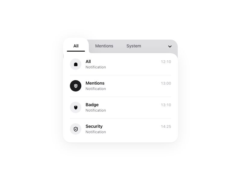
Live component. Click, hover, and type to try it.
Install
npx shadcn@latest add https://pinui.xyz/r/liquid-tabs.jsonAbout
A notifications card whose active tab is liquid, flowing from tab to tab.
Live component. Click, hover, and type to try it.
npx shadcn@latest add https://pinui.xyz/r/liquid-tabs.jsonA notifications card whose active tab is liquid, flowing from tab to tab.
"use client";

import {
  createElement,
  useCallback,
  useEffect,
  useId,
  useLayoutEffect,
  useRef,
  useState,
  type ComponentType,
  type KeyboardEvent as ReactKeyboardEvent,
  type SVGProps,
} from "react";
import { AnimatePresence, LayoutGroup, motion, type Transition, type Variants } from "motion/react";
import "./liquid-tabs.css";

/**
 * Liquid Tabs — a notifications card whose active tab is liquid.
 *
 * The card's body and the active tab are drawn as two shapes merged by a goo
 * filter, so the tab reads as part of the card — a folder tab — and when you
 * switch, it slides under the next label and flows into the body on the way.
 * The rows leave toward the side you came from and arrive from the side you
 * went to, through a blur; the selected row's avatar inverts with a bounce.
 * The chevron opens the overflow: picking one replaces the third tab, its
 * label rolling over as the tab slides to it. Arrow keys move between tabs.
 */

export type LiquidTabsItem = { id: string; title: string; subtitle: string; time: string };

export type LiquidTabsProps = {
  /** The card's corner radius, 0–40px. */
  corner?: number;
  /** How many rows each tab shows. */
  rows?: 2 | 3 | 4;
  theme?: "light" | "dark";
  /** Fired when a row is selected, with the tab it is on. */
  onSelect?: (item: LiquidTabsItem, tab: string) => void;
};

type IconType = ComponentType<SVGProps<SVGSVGElement> & { size?: number | string; strokeWidth?: number | string }>;
type Item = LiquidTabsItem & { icon: IconType };
type TabKey = "all" | "mentions" | "system" | "archived" | "requests";

/* ── icons: Lucide's, inlined, so the component needs nothing but Motion ── */

type IconNode = [string, Record<string, string>][];
function lucide(node: IconNode): IconType {
  function Icon({ size = 24, strokeWidth = 2, ...props }: SVGProps<SVGSVGElement> & { size?: number | string; strokeWidth?: number | string }) {
    return (
      <svg
        width={size}
        height={size}
        viewBox="0 0 24 24"
        fill="none"
        stroke="currentColor"
        strokeWidth={strokeWidth}
        strokeLinecap="round"
        strokeLinejoin="round"
        aria-hidden="true"
        {...props}
      >
        {node.map(([tag, attrs], i) => createElement(tag, { key: i, ...attrs }))}
      </svg>
    );
  }
  return Icon;
}

const AtSign = lucide([["circle", {"cx": "12", "cy": "12", "r": "4"}], ["path", {"d": "M16 8v5a3 3 0 0 0 6 0v-1a10 10 0 1 0-4 8"}]]);
const Check = lucide([["path", {"d": "M20 6 9 17l-5-5"}]]);
const ChevronDown = lucide([["path", {"d": "m6 9 6 6 6-6"}]]);
const Clock = lucide([["circle", {"cx": "12", "cy": "12", "r": "10"}], ["path", {"d": "M12 6v6l4 2"}]]);
const HardDrive = lucide([["path", {"d": "M10 16h.01"}], ["path", {"d": "M2.212 11.577a2 2 0 0 0-.212.896V18a2 2 0 0 0 2 2h16a2 2 0 0 0 2-2v-5.527a2 2 0 0 0-.212-.896L18.55 5.11A2 2 0 0 0 16.76 4H7.24a2 2 0 0 0-1.79 1.11z"}], ["path", {"d": "M21.946 12.013H2.054"}], ["path", {"d": "M6 16h.01"}]]);
const Inbox = lucide([["polyline", {"points": "22 12 16 12 14 15 10 15 8 12 2 12"}], ["path", {"d": "M5.45 5.11 2 12v6a2 2 0 0 0 2 2h16a2 2 0 0 0 2-2v-6l-3.45-6.89A2 2 0 0 0 16.76 4H7.24a2 2 0 0 0-1.79 1.11z"}]]);
const Link2 = lucide([["path", {"d": "M9 17H7A5 5 0 0 1 7 7h2"}], ["path", {"d": "M15 7h2a5 5 0 1 1 0 10h-2"}], ["line", {"x1": "8", "x2": "16", "y1": "12", "y2": "12"}]]);
const Mail = lucide([["path", {"d": "m22 7-8.991 5.727a2 2 0 0 1-2.009 0L2 7"}], ["rect", {"x": "2", "y": "4", "width": "20", "height": "16", "rx": "2"}]]);
const MessageCircle = lucide([["path", {"d": "M2.992 16.342a2 2 0 0 1 .094 1.167l-1.065 3.29a1 1 0 0 0 1.236 1.168l3.413-.998a2 2 0 0 1 1.099.092 10 10 0 1 0-4.777-4.719"}]]);
const Package = lucide([["path", {"d": "M11 21.73a2 2 0 0 0 2 0l7-4A2 2 0 0 0 21 16V8a2 2 0 0 0-1-1.73l-7-4a2 2 0 0 0-2 0l-7 4A2 2 0 0 0 3 8v8a2 2 0 0 0 1 1.73z"}], ["path", {"d": "M12 22V12"}], ["polyline", {"points": "3.29 7 12 12 20.71 7"}], ["path", {"d": "m7.5 4.27 9 5.15"}]]);
const Quote = lucide([["path", {"d": "M16 3a2 2 0 0 0-2 2v6a2 2 0 0 0 2 2 1 1 0 0 1 1 1v1a2 2 0 0 1-2 2 1 1 0 0 0-1 1v2a1 1 0 0 0 1 1 6 6 0 0 0 6-6V5a2 2 0 0 0-2-2z"}], ["path", {"d": "M5 3a2 2 0 0 0-2 2v6a2 2 0 0 0 2 2 1 1 0 0 1 1 1v1a2 2 0 0 1-2 2 1 1 0 0 0-1 1v2a1 1 0 0 0 1 1 6 6 0 0 0 6-6V5a2 2 0 0 0-2-2z"}]]);
const RefreshCw = lucide([["path", {"d": "M3 12a9 9 0 0 1 9-9 9.75 9.75 0 0 1 6.74 2.74L21 8"}], ["path", {"d": "M21 3v5h-5"}], ["path", {"d": "M21 12a9 9 0 0 1-9 9 9.75 9.75 0 0 1-6.74-2.74L3 16"}], ["path", {"d": "M8 16H3v5"}]]);
const Reply = lucide([["path", {"d": "M20 18v-2a4 4 0 0 0-4-4H4"}], ["path", {"d": "m9 17-5-5 5-5"}]]);
const Settings = lucide([["path", {"d": "M9.671 4.136a2.34 2.34 0 0 1 4.659 0 2.34 2.34 0 0 0 3.319 1.915 2.34 2.34 0 0 1 2.33 4.033 2.34 2.34 0 0 0 0 3.831 2.34 2.34 0 0 1-2.33 4.033 2.34 2.34 0 0 0-3.319 1.915 2.34 2.34 0 0 1-4.659 0 2.34 2.34 0 0 0-3.32-1.915 2.34 2.34 0 0 1-2.33-4.033 2.34 2.34 0 0 0 0-3.831A2.34 2.34 0 0 1 6.35 6.051a2.34 2.34 0 0 0 3.319-1.915"}], ["circle", {"cx": "12", "cy": "12", "r": "3"}]]);
const ShieldCheck = lucide([["path", {"d": "M20 13c0 5-3.5 7.5-7.66 8.95a1 1 0 0 1-.67-.01C7.5 20.5 4 18 4 13V6a1 1 0 0 1 1-1c2 0 4.5-1.2 6.24-2.72a1.17 1.17 0 0 1 1.52 0C14.51 3.81 17 5 19 5a1 1 0 0 1 1 1z"}], ["path", {"d": "m9 12 2 2 4-4"}]]);
const UserPlus = lucide([["path", {"d": "M16 21v-2a4 4 0 0 0-4-4H6a4 4 0 0 0-4 4v2"}], ["circle", {"cx": "9", "cy": "7", "r": "4"}], ["line", {"x1": "19", "x2": "19", "y1": "8", "y2": "14"}], ["line", {"x1": "22", "x2": "16", "y1": "11", "y2": "11"}]]);
const Users = lucide([["path", {"d": "M16 21v-2a4 4 0 0 0-4-4H6a4 4 0 0 0-4 4v2"}], ["path", {"d": "M16 3.128a4 4 0 0 1 0 7.744"}], ["path", {"d": "M22 21v-2a4 4 0 0 0-3-3.87"}], ["circle", {"cx": "9", "cy": "7", "r": "4"}]]);
const Archive = lucide([["rect", {"width": "20", "height": "5", "x": "2", "y": "3", "rx": "1"}], ["path", {"d": "M4 8v11a2 2 0 0 0 2 2h12a2 2 0 0 0 2-2V8"}], ["path", {"d": "M10 12h4"}]]);

/* the domed "badge" glyph on the first row */
function DomeIcon({ size = 18, ...props }: SVGProps<SVGSVGElement> & { size?: number | string }) {
  return (
    <svg width={size} height={size} viewBox="0 0 24 24" fill="currentColor" aria-hidden="true" {...props}>
      <path d="M4 11.2C4 6.67 7.58 3.5 12 3.5s8 3.17 8 7.7v7.3a2 2 0 0 1-2 2H6a2 2 0 0 1-2-2v-7.3Z" />
    </svg>
  );
}

/* a solid shield with an inset outline (the second row) */
function ShieldOutlineIcon({ size = 18, ...props }: SVGProps<SVGSVGElement> & { size?: number | string }) {
  return (
    <svg width={size} height={size} viewBox="0 0 24 24" fill="none" aria-hidden="true" {...props}>
      <path d="M12 2.5 19.5 5.6v5.9c0 4.6-3.1 8.3-7.5 10-4.4-1.7-7.5-5.4-7.5-10V5.6L12 2.5Z" fill="currentColor" />
      <path
        d="M12 6.6 16 8.3v3.3c0 2.5-1.6 4.5-4 5.6-2.4-1.1-4-3.1-4-5.6V8.3l4-1.7Z"
        stroke="var(--pltabs-icon-inset)"
        strokeWidth="1.8"
        strokeLinejoin="round"
      />
    </svg>
  );
}

/* a rounded shield with a small notch (the third row) */
function ShieldNotchIcon({ size = 18, ...props }: SVGProps<SVGSVGElement> & { size?: number | string }) {
  return (
    <svg width={size} height={size} viewBox="0 0 24 24" fill="none" aria-hidden="true" {...props}>
      <path d="M12 3c3 0 7.5 1.2 7.5 3.4v5c0 5.2-4.4 9.6-7.5 9.6s-7.5-4.4-7.5-9.6v-5C4.5 4.2 9 3 12 3Z" fill="currentColor" />
      <path d="M10 6.2a2 2 0 0 1 4 0v1.3h-4V6.2Z" fill="var(--pltabs-icon-inset)" />
    </svg>
  );
}

/* ── data ── */

const TAB_LABELS: Record<TabKey, string> = {
  all: "All",
  mentions: "Mentions",
  system: "System",
  archived: "Archived",
  requests: "Requests",
};

const OVERFLOW_TABS: TabKey[] = ["system", "archived", "requests"];

const DATA: Record<TabKey, Item[]> = {
  all: [
    { id: "a1", title: "All", subtitle: "Notification", time: "12:10", icon: DomeIcon },
    { id: "a2", title: "Mentions", subtitle: "Notification", time: "13:00", icon: ShieldOutlineIcon },
    { id: "a3", title: "Badge", subtitle: "Notification", time: "13:10", icon: ShieldNotchIcon },
    { id: "a4", title: "Security", subtitle: "Notification", time: "14:25", icon: ShieldCheck },
  ],
  mentions: [
    { id: "m1", title: "Ava Chen", subtitle: "Mentioned you", time: "09:42", icon: AtSign },
    { id: "m2", title: "Leo Park", subtitle: "Replied to you", time: "10:15", icon: Reply },
    { id: "m3", title: "Mia Ross", subtitle: "Commented", time: "11:30", icon: MessageCircle },
    { id: "m4", title: "Noah Kim", subtitle: "Quoted you", time: "12:05", icon: Quote },
  ],
  system: [
    { id: "s1", title: "Update", subtitle: "Version 2.4 ready", time: "08:00", icon: RefreshCw },
    { id: "s2", title: "Security", subtitle: "New sign-in", time: "08:45", icon: ShieldCheck },
    { id: "s3", title: "Storage", subtitle: "80% used", time: "10:20", icon: HardDrive },
    { id: "s4", title: "Settings", subtitle: "Preferences saved", time: "11:55", icon: Settings },
  ],
  archived: [
    { id: "r1", title: "Inbox", subtitle: "Cleared", time: "Mon", icon: Inbox },
    { id: "r2", title: "Delivery", subtitle: "Package arrived", time: "Sun", icon: Package },
    { id: "r3", title: "Reminder", subtitle: "Snoozed", time: "Sat", icon: Clock },
    { id: "r4", title: "Archive", subtitle: "12 items", time: "Fri", icon: Archive },
  ],
  requests: [
    { id: "q1", title: "Sam Lee", subtitle: "Wants to connect", time: "07:30", icon: UserPlus },
    { id: "q2", title: "Design Team", subtitle: "Invite to join", time: "09:10", icon: Users },
    { id: "q3", title: "Shared link", subtitle: "Access requested", time: "10:40", icon: Link2 },
    { id: "q4", title: "Newsletter", subtitle: "Confirm email", time: "13:20", icon: Mail },
  ],
};

/* ── motion ── */

const TAB_H = 52; // the tab strip
const ROW_H = 72; // one row

/* springs with no wobble — just a smooth settle */
const blobSpring: Transition = { type: "spring", visualDuration: 0.55, bounce: 0.12 };
const smooth: Transition = { type: "spring", visualDuration: 0.4, bounce: 0 };
const glide: Transition = { type: "spring", visualDuration: 0.3, bounce: 0 };

const listVariants: Variants = {
  initial: {},
  animate: { transition: { staggerChildren: 0.04, delayChildren: 0.05 } },
  exit: { transition: { staggerChildren: 0.02 } },
};

const rowVariants: Variants = {
  initial: (dir: number) => ({ opacity: 0, x: dir * 18, filter: "blur(4px)" }),
  animate: {
    opacity: 1,
    x: 0,
    filter: "blur(0px)",
    transition: { type: "spring", visualDuration: 0.45, bounce: 0 },
  },
  exit: (dir: number) => ({
    opacity: 0,
    x: dir * -18,
    filter: "blur(4px)",
    transition: { duration: 0.2, ease: [0.4, 0, 0.2, 1] },
  }),
};

/* ── component ── */

export default function LiquidTabs({ corner = 20, rows = 4, theme = "light", onSelect }: LiquidTabsProps) {
  const radius = Math.min(40, Math.max(0, corner));
  const rowCount = rows;

  const uid = useId().replace(/[^a-zA-Z0-9_-]/g, "");
  const gooId = `pltabs-goo-${uid}`;

  const [third, setThird] = useState<TabKey>("system");
  const visibleTabs: TabKey[] = ["all", "mentions", third];

  const [active, setActive] = useState<TabKey>("all");
  const [dir, setDir] = useState(1);
  const [hovered, setHovered] = useState<number | null>(null);
  const [selected, setSelected] = useState<Record<TabKey, string>>({
    all: "a2",
    mentions: "m1",
    system: "s2",
    archived: "r1",
    requests: "q1",
  });
  const [menuOpen, setMenuOpen] = useState(false);

  /* the active tab is measured, so the liquid tab can slide under it */
  const rootRef = useRef<HTMLDivElement>(null);
  const tabRefs = useRef<Partial<Record<TabKey, HTMLButtonElement | null>>>({});
  const [blob, setBlob] = useState<{ x: number; w: number } | null>(null);

  const measure = useCallback(() => {
    const root = rootRef.current;
    const el = tabRefs.current[active];
    if (!root || !el) return;
    const r = root.getBoundingClientRect();
    const t = el.getBoundingClientRect();
    setBlob({ x: t.left - r.left, w: t.width });
  }, [active]);

  useLayoutEffect(measure, [measure, third]);

  useEffect(() => {
    const ro = new ResizeObserver(measure);
    if (rootRef.current) ro.observe(rootRef.current);
    Object.values(tabRefs.current).forEach((el) => el && ro.observe(el));
    document.fonts?.ready.then(measure).catch(() => {});
    return () => ro.disconnect();
  }, [measure, third]);

  const selectTab = (key: TabKey) => {
    if (key === active) return;
    const order: TabKey[] = ["all", "mentions", ...OVERFLOW_TABS];
    setDir(order.indexOf(key) > order.indexOf(active) ? 1 : -1);
    setHovered(null);
    setActive(key);
  };

  const onTabKeyDown = (e: ReactKeyboardEvent<HTMLButtonElement>, index: number) => {
    if (e.key !== "ArrowRight" && e.key !== "ArrowLeft") return;
    e.preventDefault();
    const next = (index + (e.key === "ArrowRight" ? 1 : -1) + visibleTabs.length) % visibleTabs.length;
    selectTab(visibleTabs[next]);
    tabRefs.current[visibleTabs[next]]?.focus();
  };

  const pickOverflow = (key: TabKey) => {
    setMenuOpen(false);
    setThird(key);
    selectTab(key);
  };

  /* the menu closes on a press outside it, or Escape */
  const menuRef = useRef<HTMLDivElement>(null);
  useEffect(() => {
    if (!menuOpen) return;
    const onDown = (e: PointerEvent) => {
      if (!menuRef.current?.contains(e.target as Node)) setMenuOpen(false);
    };
    const onKey = (e: KeyboardEvent) => e.key === "Escape" && setMenuOpen(false);
    window.addEventListener("pointerdown", onDown);
    window.addEventListener("keydown", onKey);
    return () => {
      window.removeEventListener("pointerdown", onDown);
      window.removeEventListener("keydown", onKey);
    };
  }, [menuOpen]);

  const items = DATA[active].slice(0, rowCount);

  return (
    <LayoutGroup id={uid}>
      <div ref={rootRef} className="pltabs" data-theme={theme} style={{ height: TAB_H + rowCount * ROW_H + 8 }}>
        {/* the goo: blur, then pull the alpha back to a hard edge */}
        <svg aria-hidden="true" className="pltabs__defs">
          <defs>
            <filter id={gooId} x="-10%" y="-10%" width="120%" height="120%" colorInterpolationFilters="sRGB">
              <feGaussianBlur in="SourceGraphic" stdDeviation="5" result="blur" />
              <feColorMatrix in="blur" mode="matrix" values="1 0 0 0 0  0 1 0 0 0  0 0 1 0 0  0 0 0 20 -8" />
            </filter>
          </defs>
        </svg>

        {/* the grey strip behind the inactive tabs */}
        <div
          aria-hidden="true"
          className="pltabs__strip"
          style={{ height: TAB_H + radius, borderTopLeftRadius: radius + 4, borderTopRightRadius: radius + 4 }}
        />

        {/* the card: its body and the liquid tab, merged by the goo */}
        <div aria-hidden="true" className="pltabs__surface">
          <div className="pltabs__gooLayer" style={{ filter: `url(#${gooId})` }}>
            <div className="pltabs__body" style={{ top: TAB_H, borderRadius: radius + 2 }} />
            {blob && (
              <motion.div
                className="pltabs__blob"
                style={{ height: TAB_H + 18, borderRadius: radius + 2 }}
                initial={false}
                animate={{ x: blob.x, width: blob.w }}
                transition={blobSpring}
              />
            )}
          </div>
        </div>

        {/* ── tabs ── */}
        <div className="pltabs__bar" style={{ height: TAB_H }}>
          <div role="tablist" aria-label="Notifications" className="pltabs__tabs">
            {visibleTabs.map((key, i) => {
              const isActive = key === active;
              return (
                <button
                  key={i}
                  ref={(el) => {
                    tabRefs.current[key] = el;
                  }}
                  type="button"
                  role="tab"
                  aria-selected={isActive}
                  tabIndex={isActive ? 0 : -1}
                  onClick={() => selectTab(key)}
                  onKeyDown={(e) => onTabKeyDown(e, i)}
                  className="pltabs__tab"
                  data-active={isActive}
                >
                  <span className="pltabs__tabLabel">
                    <AnimatePresence mode="popLayout" initial={false}>
                      <motion.span
                        key={key}
                        className="pltabs__tabText"
                        initial={{ y: 10, opacity: 0, filter: "blur(3px)" }}
                        animate={{ y: 0, opacity: 1, filter: "blur(0px)" }}
                        exit={{ y: -10, opacity: 0, filter: "blur(3px)" }}
                        transition={smooth}
                      >
                        {TAB_LABELS[key]}
                      </motion.span>
                    </AnimatePresence>
                  </span>

                  {isActive && <motion.span layoutId="underline" className="pltabs__underline" transition={blobSpring} />}
                </button>
              );
            })}
          </div>

          {/* the overflow: a chevron and its menu */}
          <div ref={menuRef} className="pltabs__more">
            <button
              type="button"
              aria-label="More tabs"
              aria-haspopup="menu"
              aria-expanded={menuOpen}
              onClick={() => setMenuOpen((o) => !o)}
              className="pltabs__chevron"
            >
              <motion.span animate={{ rotate: menuOpen ? 180 : 0 }} transition={smooth} className="pltabs__chevronIcon">
                <ChevronDown size={18} strokeWidth={2.4} />
              </motion.span>
            </button>

            <AnimatePresence>
              {menuOpen && (
                <motion.div
                  role="menu"
                  initial={{ opacity: 0, scale: 0.95, y: -6, filter: "blur(4px)" }}
                  animate={{ opacity: 1, scale: 1, y: 0, filter: "blur(0px)" }}
                  exit={{ opacity: 0, scale: 0.97, y: -4, filter: "blur(3px)" }}
                  transition={smooth}
                  style={{ transformOrigin: "top right", borderRadius: Math.max(10, radius - 6) }}
                  className="pltabs__menu"
                >
                  {OVERFLOW_TABS.map((key, i) => (
                    <motion.button
                      key={key}
                      type="button"
                      role="menuitemradio"
                      aria-checked={third === key}
                      onClick={() => pickOverflow(key)}
                      initial={{ opacity: 0, x: 6 }}
                      animate={{ opacity: 1, x: 0, transition: { ...glide, delay: 0.03 * i } }}
                      className="pltabs__menuItem"
                    >
                      {TAB_LABELS[key]}
                      {third === key && (
                        <motion.span layoutId="menu-check" transition={glide} className="pltabs__check">
                          <Check size={14} strokeWidth={2.6} />
                        </motion.span>
                      )}
                    </motion.button>
                  ))}
                </motion.div>
              )}
            </AnimatePresence>
          </div>
        </div>

        {/* ── rows ── */}
        <div
          role="tabpanel"
          aria-label={TAB_LABELS[active]}
          className="pltabs__panel"
          style={{ height: rowCount * ROW_H }}
          onMouseLeave={() => setHovered(null)}
        >
          <AnimatePresence mode="popLayout" initial={false} custom={dir}>
            <motion.ul
              key={active}
              role="listbox"
              aria-label={`${TAB_LABELS[active]} notifications`}
              custom={dir}
              variants={listVariants}
              initial="initial"
              animate="animate"
              exit="exit"
              className="pltabs__list"
            >
              {items.map((item, i) => {
                const isSelected = selected[active] === item.id;
                const Icon = item.icon;
                const hideDivider = hovered === i || hovered === i - 1;
                return (
                  <motion.li key={item.id} custom={dir} variants={rowVariants} className="pltabs__item">
                    {i > 0 && <span aria-hidden="true" className="pltabs__divider" style={{ opacity: hideDivider ? 0 : 1 }} />}

                    <motion.button
                      type="button"
                      role="option"
                      aria-selected={isSelected}
                      onClick={() => {
                        setSelected((s) => ({ ...s, [active]: item.id }));
                        onSelect?.({ id: item.id, title: item.title, subtitle: item.subtitle, time: item.time }, active);
                      }}
                      onMouseEnter={() => setHovered(i)}
                      onFocus={() => setHovered(i)}
                      whileTap={{ scale: 0.985 }}
                      transition={glide}
                      className="pltabs__row"
                      style={{ height: ROW_H }}
                    >
                      {hovered === i && (
                        <motion.span
                          layoutId="row-hover"
                          aria-hidden="true"
                          className="pltabs__hover"
                          style={{ borderRadius: Math.max(8, radius - 8) }}
                          transition={smooth}
                        />
                      )}

                      {/* the avatar: its colours come from the theme and cross-fade */}
                      <motion.span
                        data-selected={isSelected}
                        className="pltabs__avatar"
                        initial={false}
                        animate={{ scale: isSelected ? [0.9, 1.04, 1] : 1 }}
                        transition={{ duration: 0.45, ease: [0.22, 1, 0.36, 1] }}
                      >
                        <Icon size={17} strokeWidth={2.4} />
                      </motion.span>

                      <span className="pltabs__text">
                        <span className="pltabs__title">{item.title}</span>
                        <span className="pltabs__subtitle">{item.subtitle}</span>
                      </span>

                      <span className="pltabs__time">{item.time}</span>
                    </motion.button>
                  </motion.li>
                );
              })}
            </motion.ul>
          </AnimatePresence>
        </div>
      </div>
    </LayoutGroup>
  );
}