NotificationNew
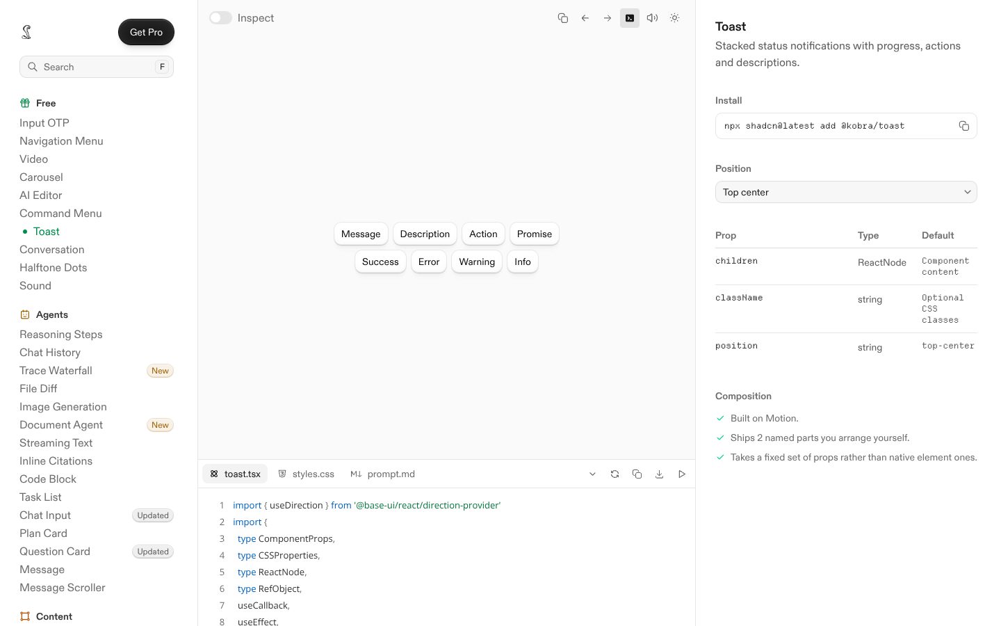
Live component. Click, hover, and type to try it.
Install
npx shadcn@latest add https://boardui.com/r/notification.jsonAbout
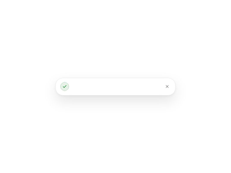
Dismissible notification with status icons, avatars, action buttons, and timed countdown.
Live component. Click, hover, and type to try it.
npx shadcn@latest add https://boardui.com/r/notification.jsonDismissible notification with status icons, avatars, action buttons, and timed countdown.
"use client";

import { useDirection } from "@/components/foundations/direction/direction";
import type {
  ComponentType,
  HTMLAttributes,
  ReactNode,
  Ref,
} from "react";
import {
  Children,
  isValidElement,
  useEffect,
  useState,
  useSyncExternalStore,
} from "react";
import { createPortal } from "react-dom";
import {
  RiCheckboxCircleFill,
  RiErrorWarningFill,
  RiInformationFill,
  RiNotification3Fill,
} from "@remixicon/react";
import { AnimatePresence, motion } from "motion/react";
import { Avatar, type AvatarProps } from "@/components/base/avatar/avatar";
import { Button, type ButtonProps } from "@/components/base/buttons/button";
import { CloseButton } from "@/components/base/buttons/close-button";
import { cx, sortCx } from "@/utils/cx";

export type NotificationStatus = "neutral" | "information" | "success" | "error";

export type NotificationPosition =
  | "top-start"
  | "top-end"
  | "bottom-start"
  | "bottom-end"
  | "top-left"
  | "top-center"
  | "top-right"
  | "bottom-left"
  | "bottom-center"
  | "bottom-right";

type IconComponent = ComponentType<{
  className?: string;
  "aria-hidden"?: boolean | "true" | "false";
}>;

export type NotificationAvatar = Omit<AvatarProps, "size"> & {
  presence?: "online" | "busy" | "offline";
};

export type NotificationAction = {
  label: ReactNode;
  onClick?: () => void;
  variant?: ButtonProps["variant"];
};

export interface NotificationProps
  extends Omit<
    HTMLAttributes<HTMLDivElement>,
    | "title"
    | "onDrag"
    | "onDragStart"
    | "onDragEnd"
    | "onAnimationStart"
    | "onAnimationEnd"
  > {
  title: ReactNode;
  description?: ReactNode;
  timestamp?: ReactNode;
  status?: NotificationStatus;
  /** Custom leading icon. Defaults to the icon associated with `status`. */
  icon?: IconComponent;
  /** Avatar leading visual. When set, it takes precedence over `icon`. */
  avatar?: NotificationAvatar;
  /** Optional small BoardUI action buttons rendered below the message. */
  actions?: NotificationAction[];
  dismissible?: boolean;
  closeLabel?: string;
  /** Called after the dismiss animation completes. */
  onDismiss?: () => void;
  /**
   * Automatically dismiss after this many milliseconds. A 3px blue countdown
   * bar is rendered along the full bottom edge for the same duration.
   */
  autoDismissDuration?: number;
  /** Optional entrance delay in seconds. */
  introDelay?: number;
  ref?: Ref<HTMLDivElement>;
}

export interface NotificationViewportProps
  extends Omit<
    HTMLAttributes<HTMLDivElement>,
    | "children"
    | "onDrag"
    | "onDragStart"
    | "onDragEnd"
    | "onAnimationStart"
    | "onAnimationEnd"
  > {
  children?: ReactNode;
  /** Edge or corner where the notification stack is anchored. */
  position?: NotificationPosition;
  /** @deprecated Use `position` instead. */
  placement?: Extract<NotificationPosition, "bottom-left" | "bottom-right">;
}

const STATUS_ICON: Record<NotificationStatus, IconComponent> = {
  neutral: RiNotification3Fill,
  information: RiInformationFill,
  success: RiCheckboxCircleFill,
  error: RiErrorWarningFill,
};

const styles = sortCx({
  card: [
    "relative flex w-full items-start gap-3 overflow-hidden p-4 pe-11",
    "rounded-2xl border border-border-button-default",
    "bg-background-primary-default shadow-dropdown",
  ].join(" "),
  visual: "relative flex size-10 shrink-0 items-center justify-center rounded-full",
  icon: "size-5",
  content: "flex min-w-0 flex-1 flex-col gap-1",
  header: "flex min-w-0 flex-wrap items-baseline gap-x-2 gap-y-0.5",
  title: "text-body-medium text-text-primary",
  timestamp: "text-body-regular text-text-tertiary",
  description: "text-body-regular text-text-secondary",
  actions: "mt-1.5 flex flex-wrap items-center gap-2",
  close: "absolute top-3 end-3",
  status: {
    neutral: "bg-background-tertiary-default text-text-secondary",
    information:
      "bg-notification-information-background text-notification-information-foreground",
    success:
      "bg-notification-success-background text-notification-success-foreground",
    error:
      "bg-notification-error-background text-notification-error-foreground",
  },
  presence: {
    online: "bg-lime-500",
    busy: "bg-rose-500",
    offline: "bg-background-quaternary-hover",
  },
});

const VIEWPORT_POSITION = {
  "top-start": "top-3 start-3 items-start sm:top-6 sm:start-6",
  "top-end": "top-3 end-3 items-end sm:top-6 sm:end-6",
  "bottom-start": "bottom-3 start-3 items-start sm:bottom-6 sm:start-6",
  "bottom-end": "end-3 bottom-3 items-end sm:end-6 sm:bottom-6",
  "top-left": "top-3 left-3 items-start sm:top-6 sm:left-6",
  "top-center": "top-3 left-1/2 -translate-x-1/2 items-center sm:top-6",
  "top-right": "top-3 right-3 items-end sm:top-6 sm:right-6",
  "bottom-left": "bottom-3 left-3 items-start sm:bottom-6 sm:left-6",
  "bottom-center":
    "bottom-3 left-1/2 -translate-x-1/2 items-center sm:bottom-6",
  "bottom-right": "right-3 bottom-3 items-end sm:right-6 sm:bottom-6",
} satisfies Record<NotificationPosition, string>;

const subscribeToHydration = () => () => {};

function NotificationAvatarVisual({
  presence,
  className,
  ...avatar
}: NotificationAvatar) {
  return (
    <span className="relative shrink-0">
      <Avatar
        {...avatar}
        size="lg"
        className={cx("size-10", className)}
      />
      {presence ? (
        <span
          aria-hidden
          className={cx(
            "absolute end-0 bottom-0 size-3 rounded-full border-2 border-background-primary-default",
            styles.presence[presence],
          )}
        />
      ) : null}
    </span>
  );
}

export function Notification({
  title,
  description,
  timestamp,
  status = "neutral",
  icon,
  avatar,
  actions,
  dismissible = true,
  closeLabel = "Dismiss notification",
  onDismiss,
  autoDismissDuration,
  introDelay,
  className,
  ref,
  role,
  ...props
}: NotificationProps) {
  const [dismissed, setDismissed] = useState(false);
  const Icon = icon ?? STATUS_ICON[status];
  const hasIntro = introDelay !== undefined;
  const introDelayMs = (introDelay ?? 0) * 1000;

  useEffect(() => {
    if (!autoDismissDuration || autoDismissDuration <= 0) return;
    const timer = window.setTimeout(
      () => setDismissed(true),
      autoDismissDuration + introDelayMs,
    );
    return () => window.clearTimeout(timer);
  }, [autoDismissDuration, introDelayMs]);

  return (
    <AnimatePresence onExitComplete={onDismiss}>
      {!dismissed ? (
        <motion.div
          ref={ref}
          role={role ?? (status === "error" ? "alert" : "status")}
          initial={
            hasIntro
              ? { opacity: 0, y: 12, scale: 0.97, filter: "blur(4px)" }
              : false
          }
          animate={
            hasIntro
              ? {
                  opacity: 1,
                  y: 0,
                  scale: 1,
                  filter: "blur(0px)",
                  transition: {
                    duration: 0.25,
                    delay: introDelay,
                    ease: "easeOut",
                  },
                }
              : undefined
          }
          exit={{
            opacity: 0,
            y: 8,
            scale: 0.96,
            filter: "blur(3px)",
            transition: { duration: 0.18, ease: "easeOut" },
          }}
          className={cx(styles.card, className)}
          {...props}
        >
          {avatar ? (
            <NotificationAvatarVisual {...avatar} />
          ) : (
            <span className={cx(styles.visual, styles.status[status])}>
              <Icon className={styles.icon} aria-hidden />
            </span>
          )}

          <div className={styles.content}>
            <div className={styles.header}>
              <p className={styles.title}>{title}</p>
              {timestamp ? <span className={styles.timestamp}>{timestamp}</span> : null}
            </div>
            {description ? <p className={styles.description}>{description}</p> : null}

            {actions?.length ? (
              <div className={styles.actions}>
                {actions.map((action, index) => (
                  <Button
                    key={index}
                    size="small"
                    variant={action.variant ?? (index === 0 ? "secondary" : "primary")}
                    onClick={action.onClick}
                  >
                    {action.label}
                  </Button>
                ))}
              </div>
            ) : null}
          </div>

          {dismissible ? (
            <CloseButton
              size="xs"
              aria-label={closeLabel}
              onClick={() => setDismissed(true)}
              className={styles.close}
            />
          ) : null}

          {autoDismissDuration && autoDismissDuration > 0 ? (
            <motion.span
              aria-hidden
              className="absolute inset-x-0 bottom-0 h-[3px] origin-left rtl:origin-right bg-accent-600"
              initial={{ scaleX: 1 }}
              animate={{ scaleX: 0 }}
              transition={{
                duration: autoDismissDuration / 1000,
                delay: introDelay,
                ease: "linear",
              }}
            />
          ) : null}
        </motion.div>
      ) : null}
    </AnimatePresence>
  );
}

/**
 * Viewport-level notification region. Anchor the stack to any corner or
 * horizontal center with `position`; children with stable keys move smoothly
 * as notifications enter and leave.
 */
export function NotificationViewport({
  children,
  position,
  placement,
  className,
  "aria-label": ariaLabel = "Notifications",
  ...props
}: NotificationViewportProps) {
  const direction = useDirection();
  const resolvedPosition = position ?? placement ?? "bottom-end";
  const mounted = useSyncExternalStore(
    subscribeToHydration,
    () => true,
    () => false,
  );

  if (!mounted || typeof document === "undefined") return null;

  return createPortal(
    <motion.div
      layoutRoot
      dir={direction}
      aria-label={ariaLabel}
      className={cx(
        "pointer-events-none fixed z-100 flex w-[min(400px,calc(100vw-24px))] flex-col gap-3",
        VIEWPORT_POSITION[resolvedPosition],
        className,
      )}
      {...props}
    >
      <AnimatePresence initial={false} mode="popLayout">
        {Children.toArray(children).map((child, index) => (
          <motion.div
            layout
            key={isValidElement(child) && child.key !== null ? child.key : index}
            className="pointer-events-auto w-full"
            transition={{
              layout: {
                type: "spring",
                stiffness: 520,
                damping: 42,
                mass: 0.7,
              },
            }}
          >
            {child}
          </motion.div>
        ))}
      </AnimatePresence>
    </motion.div>,
    document.body,
  );
}