"use client";

import { Select as SelectPrimitive } from "@base-ui/react/select";
import { cva } from "class-variance-authority";
import {
  createContext,
  useCallback,
  useContext,
  useEffect,
  useId,
  useLayoutEffect,
  useMemo,
  useRef,
  useState,
} from "react";
import type { ComponentProps, ReactNode, Ref, RefObject } from "react";

import { cn } from "@/lib/utils";

type LcdDisplayVariant = "primary" | "amber" | "green" | "cyan" | "red";
type LcdDisplaySize = "sm" | "default" | "lg";
type LcdDisplayAppearance = "auto" | "light" | "dark";

/**
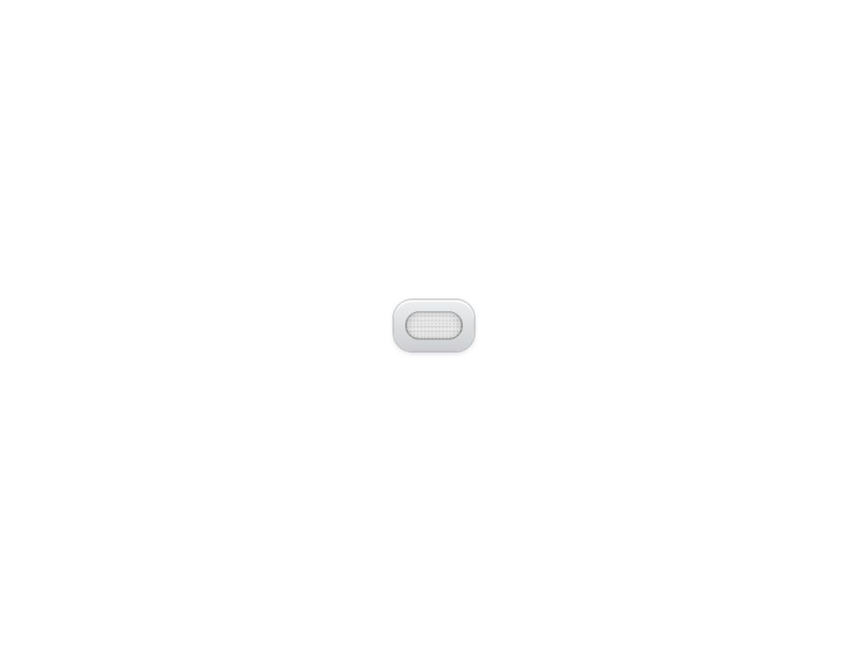
 * A backlit screen: pale glass tinted by the ink, with dark pixels and no
 * glow, like a calculator or a pager.
 */
const LIGHT_SCREEN =
  "[--lcd-display-bezel-edge:oklch(0.85_0.004_250)] [--lcd-display-bezel-ring:rgb(0_0_0/0.14)] [--lcd-display-bezel-shadow:inset_0_1px_0_rgb(255_255_255/0.8),0_1px_3px_rgb(0_0_0/0.18)] [--lcd-display-bezel:oklch(0.95_0.003_250)] [--lcd-display-glass:oklch(from_var(--lcd-display-ink)_0.93_calc(c*0.35)_h)] [--lcd-display-glow:color-mix(in_oklab,var(--lcd-display-lit)_22%,transparent)] [--lcd-display-lit:color-mix(in_oklab,var(--lcd-display-ink),black_62%)] [--lcd-display-recess:inset_0_1px_4px_rgb(0_0_0/0.28),inset_0_0_0_1px_rgb(0_0_0/0.2)] [--lcd-display-scanline:rgb(0_0_0/0.04)] [--lcd-display-sheen:rgb(255_255_255/0.35)]";

/** An unlit dark glass where the ink itself glows. */
const DARK_SCREEN =
  "[--lcd-display-bezel-edge:oklch(0.24_0.004_250)] [--lcd-display-bezel-ring:rgb(0_0_0/0.7)] [--lcd-display-bezel-shadow:inset_0_1px_0_rgb(255_255_255/0.06),0_2px_6px_rgb(0_0_0/0.5)] [--lcd-display-bezel:oklch(0.33_0.004_250)] [--lcd-display-glass:oklch(0.15_0.004_200)] [--lcd-display-glow:color-mix(in_oklab,var(--lcd-display-lit)_60%,transparent)] [--lcd-display-lit:var(--lcd-display-ink)] [--lcd-display-recess:inset_0_2px_10px_rgb(0_0_0/0.9),inset_0_0_0_1px_rgb(0_0_0/0.8)] [--lcd-display-scanline:rgb(0_0_0/0.22)] [--lcd-display-sheen:rgb(255_255_255/0.05)]";

/** The dark screen under the site's `.dark` class, written out for Tailwind. */
const DARK_SCREEN_IN_DARK_THEME =
  "dark:[--lcd-display-bezel-edge:oklch(0.24_0.004_250)] dark:[--lcd-display-bezel-ring:rgb(0_0_0/0.7)] dark:[--lcd-display-bezel-shadow:inset_0_1px_0_rgb(255_255_255/0.06),0_2px_6px_rgb(0_0_0/0.5)] dark:[--lcd-display-bezel:oklch(0.33_0.004_250)] dark:[--lcd-display-glass:oklch(0.15_0.004_200)] dark:[--lcd-display-glow:color-mix(in_oklab,var(--lcd-display-lit)_60%,transparent)] dark:[--lcd-display-lit:var(--lcd-display-ink)] dark:[--lcd-display-recess:inset_0_2px_10px_rgb(0_0_0/0.9),inset_0_0_0_1px_rgb(0_0_0/0.8)] dark:[--lcd-display-scanline:rgb(0_0_0/0.22)] dark:[--lcd-display-sheen:rgb(255_255_255/0.05)]";

/**
 * The hardware colours, the ink and the dot grid. The lit, dim and unlit
 * pixels are mixed from `--lcd-display-ink`, so a custom colour needs only
 * that one variable, in both appearances.
 */
const lcdDisplayVariants = cva(
  "[--lcd-display-font:var(--font-mono)] [--lcd-display-ink-dim:color-mix(in_oklab,var(--lcd-display-lit)_40%,transparent)] [--lcd-display-ink-unlit:color-mix(in_oklab,var(--lcd-display-lit)_7%,transparent)] [--lcd-display-pitch:2px]",
  {
    defaultVariants: {
      appearance: "auto",
      size: "default",
      variant: "primary",
    },
    variants: {
      appearance: {
        auto: `${LIGHT_SCREEN} ${DARK_SCREEN_IN_DARK_THEME}`,
        dark: DARK_SCREEN,
        light: LIGHT_SCREEN,
      },
      size: {
        default: "text-lg",
        lg: "text-2xl",
        sm: "text-sm",
      },
      variant: {
        amber: "[--lcd-display-ink:oklch(0.76_0.13_52)]",
        cyan: "[--lcd-display-ink:oklch(0.84_0.12_205)]",
        green: "[--lcd-display-ink:oklch(0.85_0.19_142)]",
        primary: "[--lcd-display-ink:var(--primary)]",
        red: "[--lcd-display-ink:oklch(0.68_0.2_27)]",
      },
    },
  }
);

interface LcdDisplayContextValue {
  /** The display itself, whose variables the portalled popup copies. */
  rootRef: RefObject<HTMLDivElement | null> | null;
  appearance: LcdDisplayAppearance;
  variant: LcdDisplayVariant;
  size: LcdDisplaySize;
  matrix: boolean;
  scanlines: boolean;
}

const LcdDisplayContext = createContext<LcdDisplayContextValue>({
  appearance: "auto",
  matrix: true,
  rootRef: null,
  scanlines: true,
  size: "default",
  variant: "primary",
});

const RowContext = createContext<{
  labelId: string;
  setCustomLabelId: (id: string | undefined) => void;
} | null>(null);

/**
 * The variables a caller may set on the display. The popup is portalled out
 * of it, so it copies them instead of inheriting them.
 */
const SHARED_VARIABLES = [
  "--lcd-display-bezel",
  "--lcd-display-bezel-edge",
  "--lcd-display-font",
  "--lcd-display-glass",
  "--lcd-display-glow",
  "--lcd-display-ink",
  "--lcd-display-ink-dim",
  "--lcd-display-ink-unlit",
  "--lcd-display-lit",
  "--lcd-display-pitch",
] as const;

/** Points every ref at the element, so a caller's ref works beside ours. */
const mergeRefs =
  <T,>(...refs: (Ref<T> | undefined)[]) =>
  (node: T) => {
    const cleanups = refs.map((ref) => {
      if (typeof ref === "function") {
        const cleanup = ref(node);
        return typeof cleanup === "function" ? cleanup : () => ref(null);
      }
      if (ref) {
        ref.current = node;
        return () => {
          ref.current = null;
        };
      }
      return null;
    });
    return () => {
      for (const cleanup of cleanups) {
        cleanup?.();
      }
    };
  };

/**
 * Dims a part for a moment when its text changes, like segments redrawing.
 * Watches the DOM rather than renders, so it also catches text that a child
 * updates on its own, like a select's value, and costs no render.
 */
const useChangeFlicker = (ref: RefObject<HTMLElement | null>) => {
  useEffect(() => {
    const element = ref.current;
    if (!element) {
      return;
    }
    let text = element.textContent;
    let frame = 0;
    const observer = new MutationObserver(() => {
      if (element.textContent === text) {
        return;
      }
      text = element.textContent;
      cancelAnimationFrame(frame);
      element.dataset.changed = "";
      // Two frames: one to paint dimmed, one to start the fade back.
      frame = requestAnimationFrame(() => {
        frame = requestAnimationFrame(() => {
          delete element.dataset.changed;
        });
      });
    });
    observer.observe(element, {
      characterData: true,
      childList: true,
      subtree: true,
    });
    return () => {
      observer.disconnect();
      cancelAnimationFrame(frame);
      delete element.dataset.changed;
    };
  }, [ref]);
};

const FLICKER =
  "transition-opacity duration-150 data-changed:opacity-35 data-changed:duration-0 motion-reduce:transition-none motion-reduce:data-changed:opacity-100";

/** The glass: unlit dots behind, scanlines in front, glowing dotted ink between. */
const LcdScreen = ({
  matrix,
  scanlines,
  className,
  contentClassName,
  children,
}: {
  matrix: boolean;
  scanlines: boolean;
  className?: string;
  contentClassName?: string;
  children: ReactNode;
}) => (
  <div
    className={cn(
      "relative isolate overflow-hidden rounded-md bg-(--lcd-display-glass) shadow-(--lcd-display-recess)",
      matrix &&
        "before:pointer-events-none before:absolute before:inset-0 before:bg-[radial-gradient(circle,var(--lcd-display-ink-unlit)_45%,transparent_55%)] before:bg-size-[var(--lcd-display-pitch)_var(--lcd-display-pitch)]",
      "after:pointer-events-none after:absolute after:inset-0 after:bg-[linear-gradient(to_bottom,var(--lcd-display-sheen),transparent_45%)]",
      scanlines &&
        "after:bg-[linear-gradient(to_bottom,var(--lcd-display-sheen),transparent_45%),repeating-linear-gradient(to_bottom,transparent_0_2px,var(--lcd-display-scanline)_2px_3px)]",
      className
    )}
    data-slot="lcd-display-screen"
  >
    <div className="drop-shadow-[0_0_3px_var(--lcd-display-glow)]">
      <div
        className={cn(
          "relative",
          matrix &&
            "mask-[radial-gradient(circle,#000_58%,transparent_64%)] mask-size-[var(--lcd-display-pitch)_var(--lcd-display-pitch)]",
          contentClassName
        )}
        data-slot="lcd-display-content"
      >
        {children}
      </div>
    </div>
  </div>
);

export interface LcdDisplayProps extends ComponentProps<"div"> {
  /**
   * The ink colour. `primary` follows the theme's `--primary`; the others are
   * fixed hardware inks. Default `primary`.
   */
  variant?: LcdDisplayVariant;
  /**
   * `light` is a backlit screen with dark pixels, `dark` an unlit screen with
   * glowing ink, and `auto` follows the theme. Default `auto`.
   */
  appearance?: LcdDisplayAppearance;
  /** The text size; rows, separator and status follow it. Default `default`. */
  size?: LcdDisplaySize;
  /** Break the text into dots on a `--lcd-display-pitch` grid. Default true. */
  matrix?: boolean;
  /** Faint horizontal scanlines over the glass. Default true. */
  scanlines?: boolean;
}

/**
 * An LCD screen in a bezel: backlit with dark pixels in the light theme, and
 * glowing ink on dark glass in the dark one. Its ink is `--lcd-display-ink`.
 */
export const LcdDisplay = ({
  variant = "primary",
  appearance = "auto",
  size = "default",
  matrix = true,
  scanlines = true,
  className,
  children,
  ref,
  ...props
}: LcdDisplayProps) => {
  const rootRef = useRef<HTMLDivElement>(null);
  const mergedRef = useMemo(() => mergeRefs(rootRef, ref), [ref]);
  const context = useMemo(
    () => ({ appearance, matrix, rootRef, scanlines, size, variant }),
    [appearance, matrix, scanlines, size, variant]
  );
  return (
    <LcdDisplayContext.Provider value={context}>
      <div
        className={cn(
          lcdDisplayVariants({ appearance, size, variant }),
          "rounded-lg bg-linear-to-b from-(--lcd-display-bezel) to-(--lcd-display-bezel-edge) p-1.5 font-(family-name:--lcd-display-font) leading-none tracking-[0.12em] uppercase shadow-(--lcd-display-bezel-shadow) ring-1 ring-(--lcd-display-bezel-ring)",
          className
        )}
        data-appearance={appearance}
        data-matrix={matrix ? "" : undefined}
        data-slot="lcd-display"
        data-size={size}
        data-variant={variant}
        ref={mergedRef}
        role="group"
        {...props}
      >
        <LcdScreen
          contentClassName="flex flex-col px-4 py-2"
          matrix={matrix}
          scanlines={scanlines}
        >
          {children}
        </LcdScreen>
      </div>
    </LcdDisplayContext.Provider>
  );
};

/** One line of the screen: a label on the left, a value on the right. */
export const LcdDisplayRow = ({
  className,
  children,
  ...props
}: ComponentProps<"div">) => {
  const generatedId = useId();
  const [customLabelId, setCustomLabelId] = useState<string>();
  const labelId = customLabelId ?? generatedId;
  const row = useMemo(() => ({ labelId, setCustomLabelId }), [labelId]);
  return (
    <RowContext.Provider value={row}>
      <div
        className={cn(
          "flex items-center justify-between gap-8 py-3",
          className
        )}
        data-slot="lcd-display-row"
        {...props}
      >
        {children}
      </div>
    </RowContext.Provider>
  );
};

/** Dim text that names a row, and the select in it. */
export const LcdDisplayLabel = ({
  className,
  id,
  ...props
}: ComponentProps<"span">) => {
  const row = useContext(RowContext);
  const setCustomLabelId = row?.setCustomLabelId;
  // A caller's id replaces the generated one, so the row's select points at it.
  useLayoutEffect(() => {
    if (!setCustomLabelId || id === undefined) {
      return;
    }
    setCustomLabelId(id);
    return () => setCustomLabelId(undefined);
  }, [id, setCustomLabelId]);
  return (
    <span
      className={cn("text-(--lcd-display-ink-dim)", className)}
      data-slot="lcd-display-label"
      id={id ?? row?.labelId}
      {...props}
    />
  );
};

export interface LcdDisplayValueProps extends ComponentProps<"span"> {
  /** Announce changes to screen readers (`aria-live="polite"`). Default false. */
  live?: boolean;
}

/** Bright, glowing text that flickers when it changes. */
export const LcdDisplayValue = ({
  live = false,
  className,
  ref,
  ...props
}: LcdDisplayValueProps) => {
  const ownRef = useRef<HTMLSpanElement>(null);
  const mergedRef = useMemo(() => mergeRefs(ownRef, ref), [ref]);
  useChangeFlicker(ownRef);
  return (
    <span
      aria-live={live ? "polite" : undefined}
      className={cn(
        "text-(--lcd-display-lit) tabular-nums",
        FLICKER,
        className
      )}
      data-slot="lcd-display-value"
      ref={mergedRef}
      {...props}
    />
  );
};

/** A dotted rule between rows. */
export const LcdDisplaySeparator = ({
  className,
  ...props
}: ComponentProps<"div">) => (
  <div
    className={cn(
      "h-(--lcd-display-pitch) shrink-0 bg-[radial-gradient(circle,var(--lcd-display-ink-dim)_45%,transparent_55%)] bg-size-[calc(var(--lcd-display-pitch)*2)_var(--lcd-display-pitch)]",
      className
    )}
    data-slot="lcd-display-separator"
    role="separator"
    {...props}
  />
);

export interface LcdDisplayStatusProps extends ComponentProps<"span"> {
  /** `idle` blinks slowly, `busy` quickly, `off` shows nothing lit. Default `idle`. */
  state?: "idle" | "busy" | "off";
}

/** The blinking pixel in the bottom-right corner of the screen. */
export const LcdDisplayStatus = ({
  state = "idle",
  className,
  ...props
}: LcdDisplayStatusProps) => (
  <span
    aria-hidden
    className={cn(
      "absolute right-2 bottom-2 size-1.5 animate-pulse bg-(--lcd-display-lit) data-[state=busy]:[animation-duration:0.6s] data-[state=off]:animate-none data-[state=off]:bg-(--lcd-display-ink-unlit) motion-reduce:animate-none",
      className
    )}
    data-slot="lcd-display-status"
    data-state={state}
    {...props}
  />
);

/** A row value the user can change, built on Base UI's Select. */
export const LcdDisplaySelect = <Value,>(
  props: SelectPrimitive.Root.Props<Value>
) => <SelectPrimitive.Root {...props} />;

/** A 5 × 3 pixel chevron. */
const PixelChevron = () => (
  <svg
    aria-hidden
    className="h-1.5 w-2.5 shrink-0"
    fill="currentColor"
    shapeRendering="crispEdges"
    viewBox="0 0 5 3"
  >
    <path d="M0 0h1v1H0zM4 0h1v1H4zM1 1h1v1H1zM3 1h1v1H3zM2 2h1v1H2z" />
  </svg>
);

export interface LcdDisplaySelectTriggerProps
  extends SelectPrimitive.Trigger.Props {
  /** Shown while nothing is selected. */
  placeholder?: ReactNode;
}

/** The selected value and a pixel chevron. Named by the row's label. */
export const LcdDisplaySelectTrigger = ({
  placeholder,
  className,
  children,
  ref,
  ...props
}: LcdDisplaySelectTriggerProps) => {
  const row = useContext(RowContext);
  const ownRef = useRef<HTMLButtonElement>(null);
  const mergedRef = useMemo(() => mergeRefs(ownRef, ref), [ref]);
  useChangeFlicker(ownRef);
  return (
    <SelectPrimitive.Trigger
      aria-labelledby={row?.labelId}
      className={cn(
        "-mx-1 inline-flex cursor-pointer items-center gap-3 rounded-sm px-1 py-0.5 text-(--lcd-display-lit) uppercase tabular-nums outline-none focus-visible:ring-1 focus-visible:ring-(--lcd-display-lit) disabled:cursor-default disabled:text-(--lcd-display-ink-dim) data-placeholder:text-(--lcd-display-ink-dim)",
        FLICKER,
        className
      )}
      data-slot="lcd-display-select-trigger"
      ref={mergedRef}
      {...props}
    >
      {children ?? <SelectPrimitive.Value placeholder={placeholder} />}
      <SelectPrimitive.Icon className="transition-transform duration-150 data-popup-open:rotate-180 motion-reduce:transition-none">
        <PixelChevron />
      </SelectPrimitive.Icon>
    </SelectPrimitive.Trigger>
  );
};

export interface LcdDisplaySelectContentProps
  extends
    SelectPrimitive.Popup.Props,
    Pick<
      SelectPrimitive.Positioner.Props,
      "align" | "alignOffset" | "side" | "sideOffset"
    > {}

/** The list of choices, drawn as a small screen in the display's ink. */
export const LcdDisplaySelectContent = ({
  align = "end",
  alignOffset = 0,
  side = "bottom",
  sideOffset = 8,
  className,
  children,
  ref,
  ...props
}: LcdDisplaySelectContentProps) => {
  const { appearance, matrix, rootRef, scanlines, size, variant } =
    useContext(LcdDisplayContext);
  // Copies the display's variables, so a custom ink or font reaches the popup.
  const shareVariables = useCallback(
    (popup: HTMLDivElement | null) => {
      const root = rootRef?.current;
      if (!(popup && root)) {
        return;
      }
      const style = getComputedStyle(root);
      for (const name of SHARED_VARIABLES) {
        const value = style.getPropertyValue(name);
        if (value) {
          popup.style.setProperty(name, value);
        }
      }
    },
    [rootRef]
  );
  const mergedRef = useMemo(
    () => mergeRefs(shareVariables, ref),
    [shareVariables, ref]
  );
  return (
    <SelectPrimitive.Portal>
      <SelectPrimitive.Positioner
        align={align}
        alignItemWithTrigger={false}
        alignOffset={alignOffset}
        className="isolate z-50"
        side={side}
        sideOffset={sideOffset}
      >
        <SelectPrimitive.Popup
          className={cn(
            lcdDisplayVariants({ appearance, size, variant }),
            "max-h-(--available-height) min-w-(--anchor-width) origin-(--transform-origin) overflow-y-auto rounded-md bg-(--lcd-display-bezel-edge) p-1 font-(family-name:--lcd-display-font) leading-none tracking-[0.12em] uppercase shadow-xl ring-1 ring-(--lcd-display-bezel-ring) transition-[opacity,scale] duration-100 outline-none data-ending-style:scale-95 data-ending-style:opacity-0 data-starting-style:scale-95 data-starting-style:opacity-0 motion-reduce:transition-none",
            className
          )}
          data-appearance={appearance}
          data-slot="lcd-display-select-content"
          data-variant={variant}
          ref={mergedRef}
          {...props}
        >
          <LcdScreen
            contentClassName="p-1"
            matrix={matrix}
            scanlines={scanlines}
          >
            <SelectPrimitive.List>{children}</SelectPrimitive.List>
          </LcdScreen>
        </SelectPrimitive.Popup>
      </SelectPrimitive.Positioner>
    </SelectPrimitive.Portal>
  );
};

/** One choice. Highlighted choices invert, like an LCD menu. */
export const LcdDisplaySelectItem = ({
  className,
  children,
  ...props
}: SelectPrimitive.Item.Props) => (
  <SelectPrimitive.Item
    className={cn(
      "flex cursor-default items-center gap-2 rounded-sm px-2 py-2 text-(--lcd-display-ink-dim) outline-none select-none data-disabled:opacity-40 data-highlighted:bg-(--lcd-display-lit) data-highlighted:text-(--lcd-display-glass) data-selected:text-(--lcd-display-lit) data-selected:data-highlighted:text-(--lcd-display-glass)",
      className
    )}
    data-slot="lcd-display-select-item"
    {...props}
  >
    {/* Keeps its width when hidden, so the choices stay aligned. */}
    <span className="size-1.5 shrink-0">
      <SelectPrimitive.ItemIndicator
        className="block size-full"
        data-slot="lcd-display-select-indicator"
      >
        {/* A lit pixel instead of Base UI's default check mark. */}
        <span className="block size-full bg-current" />
      </SelectPrimitive.ItemIndicator>
    </span>
    <SelectPrimitive.ItemText>{children}</SelectPrimitive.ItemText>
  </SelectPrimitive.Item>
);

export { lcdDisplayVariants };
export type { LcdDisplayAppearance, LcdDisplaySize, LcdDisplayVariant };