SwitchNew

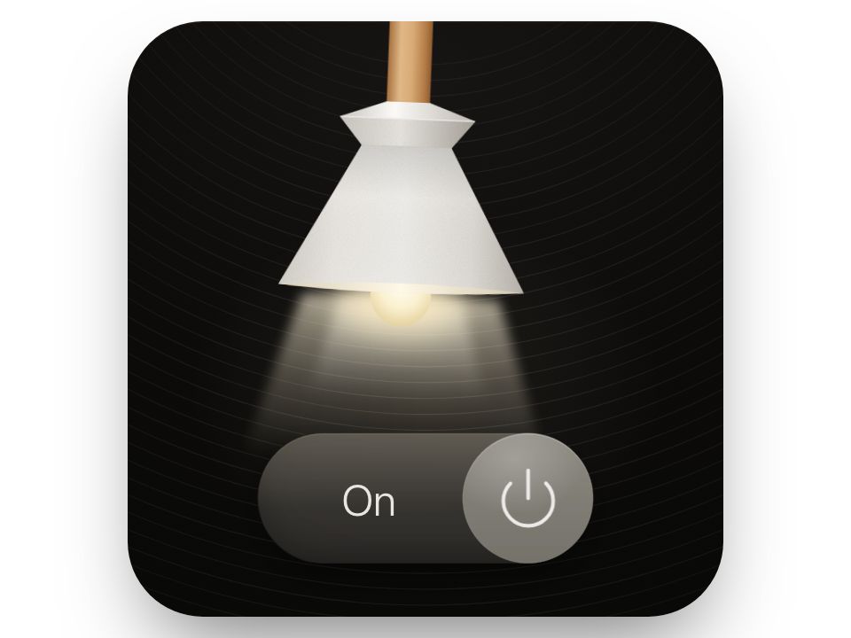
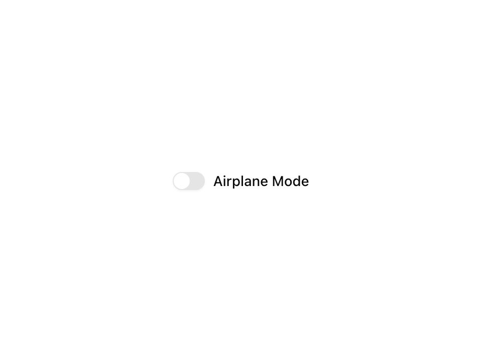
Live component. Click, hover, and type to try it.
Install
npx shadcn@latest add https://uiarc.dev/r/switch.jsonAbout
A tactile toggle for settings that take effect immediately.
Live component. Click, hover, and type to try it.
npx shadcn@latest add https://uiarc.dev/r/switch.jsonA tactile toggle for settings that take effect immediately.
"use client";

import { forwardRef, useEffect, useRef, useState } from "react";
import type { ComponentPropsWithoutRef, ElementRef } from "react";
import * as SwitchPrimitive from "@radix-ui/react-switch";
import { animate, motion, useMotionValue, useReducedMotion } from "motion/react";
import type { Transition } from "motion/react";
import { motionTokens } from "../lib/motion-tokens";
import styles from "./switch.module.css";

export interface SwitchProps extends ComponentPropsWithoutRef<typeof SwitchPrimitive.Root> {
  label?: string;
}

/** Track inner width (42 - 6 padding) minus the 18px thumb; keep in sync with switch.module.css. */
const size = 18;
const travel = 18;
/** How far the thumb widens toward the other side while pressed. */
const stretch = 5;
/** Critically damped: the thumb lands on its end without overshooting the state it reports. */
const glide: Transition = { type: "spring", visualDuration: 0.3, bounce: 0 };

export const Switch = forwardRef<ElementRef<typeof SwitchPrimitive.Root>, SwitchProps>(function Switch(
  { label, className, checked, defaultChecked, onCheckedChange, onPointerDown, onPointerUp, onPointerLeave, onPointerCancel, onKeyDown, onKeyUp, onBlur, ...props },
  ref,
) {
  const reduceMotion = useReducedMotion();
  const [internal, setInternal] = useState(defaultChecked ?? false);
  const [pressed, setPressed] = useState(false);
  const on = checked ?? internal;
  // A brief stretch along the travel, so the thumb reads as moving mass rather than a sliding dot.
  const scaleX = useMotionValue(1);
  const shown = useRef(on);
  // A pointer or Space press already stretched the thumb, so its release should not add a second stretch on top.
  const releasedAt = useRef(-Infinity);
  useEffect(() => {
    if (shown.current === on) return;
    shown.current = on;
    const fromPress = performance.now() - releasedAt.current < 250;
    if (reduceMotion || fromPress) return;
    const controls = animate(scaleX, [1, 1.16, 1], { duration: 0.34, times: [0, 0.4, 1], ease: ["easeOut", "easeInOut"] });
    return () => controls.stop();
  }, [on, reduceMotion, scaleX]);
  const extra = pressed && !reduceMotion && !props.disabled ? stretch : 0;
  const classes = [styles.switch, className].filter(Boolean).join(" ");

  return (
    <SwitchPrimitive.Root
      {...props}
      ref={ref}
      checked={on}
      onCheckedChange={next => { if (checked === undefined) setInternal(next); onCheckedChange?.(next); }}
      onPointerDown={event => { onPointerDown?.(event); if (event.button === 0) setPressed(true); }}
      onPointerUp={event => { onPointerUp?.(event); if (pressed && !props.disabled) releasedAt.current = performance.now(); setPressed(false); }}
      onPointerLeave={event => { onPointerLeave?.(event); setPressed(false); }}
      onPointerCancel={event => { onPointerCancel?.(event); setPressed(false); }}
      onKeyDown={event => { onKeyDown?.(event); if (event.key === " ") setPressed(true); }}
      onKeyUp={event => { onKeyUp?.(event); if (pressed && !props.disabled) releasedAt.current = performance.now(); setPressed(false); }}
      onBlur={event => { onBlur?.(event); setPressed(false); }}
      className={classes}
      aria-label={props["aria-label"] ?? label}
    >
      <span className={styles.track}>
        {/* The thumb stretches like a held finger and keeps its far edge anchored, then travels on a spring. */}
        <motion.span className={styles.thumb} style={{ scaleX }} initial={false} animate={{ x: on ? travel - extra : 0, width: size + extra }} transition={reduceMotion ? { duration: 0 } : { x: glide, width: motionTokens.spring.snappy }} />
      </span>
      {label ? <span className={styles.label}>{label}</span> : null}
    </SwitchPrimitive.Root>
  );
});

Switch.displayName = "Switch";

export default Switch;