ButtonNew
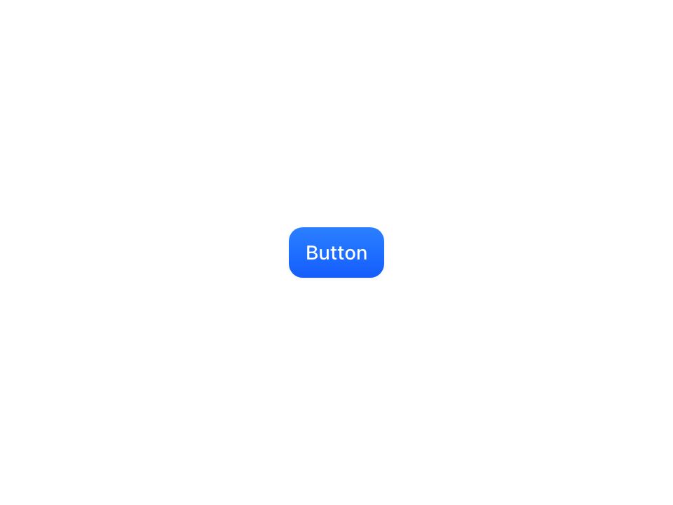
Live component. Click, hover, and type to try it.
Install
npx shadcn@latest add https://uiarc.dev/r/button.jsonAbout
A clear, responsive action with quiet secondary states.
Live component. Click, hover, and type to try it.
npx shadcn@latest add https://uiarc.dev/r/button.jsonA clear, responsive action with quiet secondary states.
"use client";

import { forwardRef, isValidElement, useCallback, useEffect, useLayoutEffect, useRef } from "react";
import type { ButtonHTMLAttributes, ReactNode, Ref, RefObject } from "react";
import { AnimatePresence, animate, motion, useIsPresent, useMotionValue, useReducedMotion } from "motion/react";
import type { TargetAndTransition, Variants } from "motion/react";
import { motionTokens } from "../lib/motion-tokens";
import styles from "./button.module.css";

export type ButtonVariant = "primary" | "secondary" | "ghost" | "danger";
export type ButtonSize = "sm" | "md" | "lg";

export interface ButtonProps extends Omit<ButtonHTMLAttributes<HTMLButtonElement>, "onDrag" | "onDragEnd" | "onDragStart" | "onAnimationStart"> {
  variant?: ButtonVariant;
  size?: ButtonSize;
  loading?: boolean;
}

/** Icon buttons press a little deeper, wide buttons a little less, so every size reads as the same push. */
const pressVariants: Variants = {
  pressed: (button: RefObject<HTMLButtonElement | null>) => {
    const width = button.current?.offsetWidth ?? 0;
    return { scale: width > 220 ? .985 : width && width <= 48 ? .96 : .97, transition: { duration: motionTokens.duration.instant, ease: [...motionTokens.ease.standard] } };
  },
};

const rest: TargetAndTransition = { opacity: 1, y: 0, scale: 1, filter: "blur(0px)" };
/** Text rises about .3em out of a soft blur; the outgoing label lifts away a little faster. */
const textIn: TargetAndTransition = { opacity: 0, y: 4, filter: `blur(${motionTokens.blur.soft}px)` };
const textOut: TargetAndTransition = { opacity: 0, y: -3, filter: `blur(${motionTokens.blur.soft}px)`, transition: { duration: motionTokens.duration.fast, ease: [...motionTokens.ease.standard] } };
const iconIn: TargetAndTransition = { opacity: 0, scale: .6, filter: `blur(${motionTokens.blur.subtle}px)` };
const iconOut: TargetAndTransition = { opacity: 0, scale: .6, filter: `blur(${motionTokens.blur.subtle}px)`, transition: { duration: motionTokens.duration.fast, ease: [...motionTokens.ease.standard] } };
const fadeIn: TargetAndTransition = { ...rest, opacity: 0 };
const fadeOut: TargetAndTransition = { opacity: 0, transition: { duration: motionTokens.duration.instant } };
/** Scale rides the spring; opacity and blur tween so blur never overshoots below zero. */
const iconEnter = { ...motionTokens.spring.snappy, opacity: { duration: motionTokens.duration.fast, ease: [...motionTokens.ease.enter] }, filter: { duration: motionTokens.duration.fast, ease: [...motionTokens.ease.enter] } } as const;

/** A key for the label content: text plus element names, so a new label or icon crossfades while prop-only updates stay in place. */
function labelKey(node: ReactNode): string {
  if (node == null || typeof node === "boolean") return "";
  if (typeof node === "string" || typeof node === "number" || typeof node === "bigint") return String(node);
  if (Array.isArray(node)) return node.map(labelKey).join("");
  if (!isValidElement(node)) return "";
  const type = node.type as string | { displayName?: string; name?: string };
  return `<${typeof type === "string" ? type : type?.displayName ?? type?.name ?? ""}>${labelKey((node.props as { children?: ReactNode }).children)}`;
}

/** Springs the slot to the natural width of the incoming label when it changes, so a new label never snaps the button's size.
 *  The outgoing label is popped out of flow at once, so it never holds the old width. Other resizes (a late web font, a parent reflow) jump straight to the new width, so nothing wobbles on first paint. */
function useMorphWidth(content: RefObject<HTMLElement | null>, key: string, reduced: boolean) {
  const width = useMotionValue<number | "auto">("auto");
  const lastKey = useRef(key), armedUntil = useRef(0);
  useLayoutEffect(() => {
    if (lastKey.current === key) return;
    lastKey.current = key;
    armedUntil.current = performance.now() + 700;
  }, [key]);
  useEffect(() => {
    const node = content.current, slot = node?.parentElement;
    if (!node || !slot || typeof ResizeObserver === "undefined") return;
    let measured = false;
    const observer = new ResizeObserver(([entry]) => {
      if (!entry) return;
      const next = entry.contentRect.width;
      if (!next || !measured || reduced || performance.now() > armedUntil.current) { measured = next > 0; width.jump(next || "auto"); delete slot.dataset.morphing; return; }
      slot.dataset.morphing = "";
      animate(width, next, { ...motionTokens.spring.morph, onComplete: () => { delete slot.dataset.morphing; } });
    });
    observer.observe(node);
    return () => observer.disconnect();
  }, [content, reduced, width]);
  return width;
}

function LabelPhase({ children, icon, reduced, ref }: { children: ReactNode; icon: boolean; reduced: boolean; ref?: Ref<HTMLSpanElement> }) {
  const present = useIsPresent();
  return <motion.span ref={ref} className={styles.labelPhase} aria-hidden={present ? undefined : true} initial={reduced ? fadeIn : icon ? iconIn : textIn} animate={rest} exit={reduced ? fadeOut : icon ? iconOut : textOut} transition={reduced ? { duration: motionTokens.duration.instant } : icon ? iconEnter : { duration: motionTokens.duration.standard, ease: [...motionTokens.ease.enter] }}>{children}</motion.span>;
}

export const Button = forwardRef<HTMLButtonElement, ButtonProps>(function Button(
  { className, variant = "primary", size = "md", loading = false, disabled, children, onClick, ...props },
  ref,
) {
  const reduceMotion = useReducedMotion() ?? false;
  const buttonRef = useRef<HTMLButtonElement | null>(null);
  const contentRef = useRef<HTMLSpanElement>(null);
  const key = labelKey(children);
  const width = useMorphWidth(contentRef, key, reduceMotion);
  const setRefs = useCallback((node: HTMLButtonElement | null) => {
    buttonRef.current = node;
    if (typeof ref === "function") ref(node); else if (ref) ref.current = node;
  }, [ref]);
  // A trigger that anchors a menu, popover, or dialog keeps its rect still while pressed, so the layer never measures a scaled anchor.
  // Radix triggers (asChild) pass aria-haspopup or data-state through; the stylesheet repeats the guard.
  const popup = props["aria-haspopup"];
  const anchorsLayer = (popup !== undefined && popup !== false && popup !== "false") || props.role === "combobox" || (props as Record<string, unknown>)["data-state"] !== undefined;
  const inert = disabled || loading || props["aria-disabled"] === true || props["aria-disabled"] === "true";
  const classes = [styles.button, styles[variant], styles[size], className].filter(Boolean).join(" ");

  return (
    <motion.button
      ref={setRefs}
      tabIndex={props.tabIndex ?? 0}
      className={classes}
      disabled={disabled}
      aria-busy={loading || undefined}
      custom={buttonRef}
      variants={pressVariants}
      whileTap={reduceMotion || anchorsLayer || inert ? undefined : "pressed"}
      transition={motionTokens.spring.snappy}
      {...props}
      // Loading keeps the button focusable (a disabled button would drop keyboard focus mid-action) and swallows presses instead.
      aria-disabled={loading || props["aria-disabled"] || undefined}
      onClick={loading ? event => event.preventDefault() : onClick}
    >
      <AnimatePresence initial={false}>
        {loading ? <motion.span key="loader" className={styles.loader} aria-hidden="true" initial={reduceMotion ? { opacity: 0 } : { opacity: 0, scale: .6 }} animate={{ opacity: 1, scale: 1 }} exit={reduceMotion ? fadeOut : { ...iconOut, scale: .8 }} transition={reduceMotion ? { duration: motionTokens.duration.instant } : iconEnter}><span className={styles.spinner} /></motion.span> : null}
      </AnimatePresence>
      <motion.span className={[styles.labelSlot, loading ? styles.loadingLabel : ""].filter(Boolean).join(" ")} style={{ width }}>
        <span ref={contentRef} className={styles.labelContent}>
          <AnimatePresence mode="popLayout" initial={false}>
            <LabelPhase key={key} icon={!/\S/.test(key.replace(/<[^>]*>/g, ""))} reduced={reduceMotion}>{children}</LabelPhase>
          </AnimatePresence>
        </span>
      </motion.span>
    </motion.button>
  );
});

Button.displayName = "Button";

export default Button;