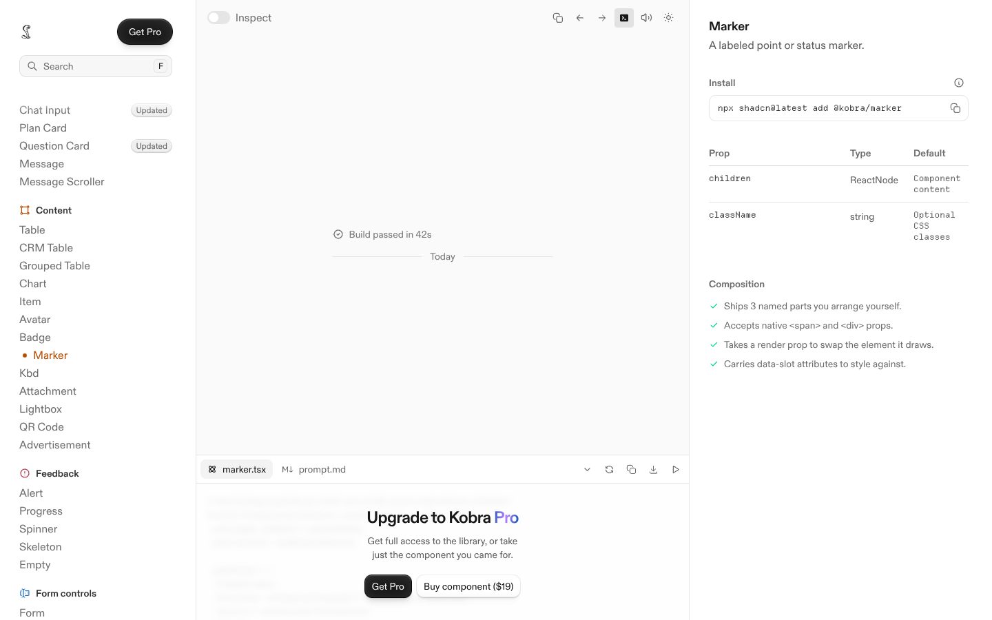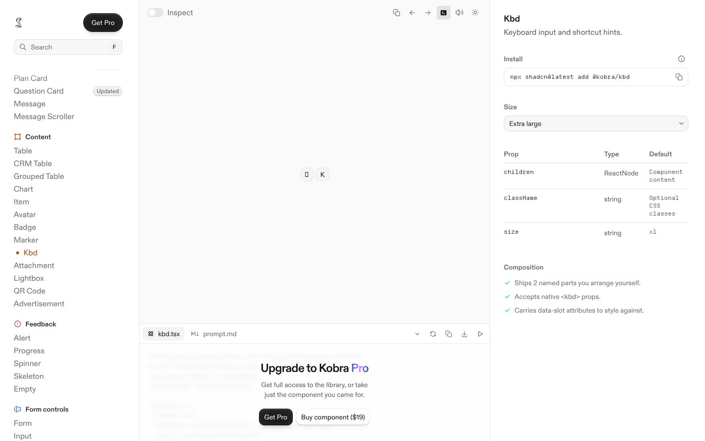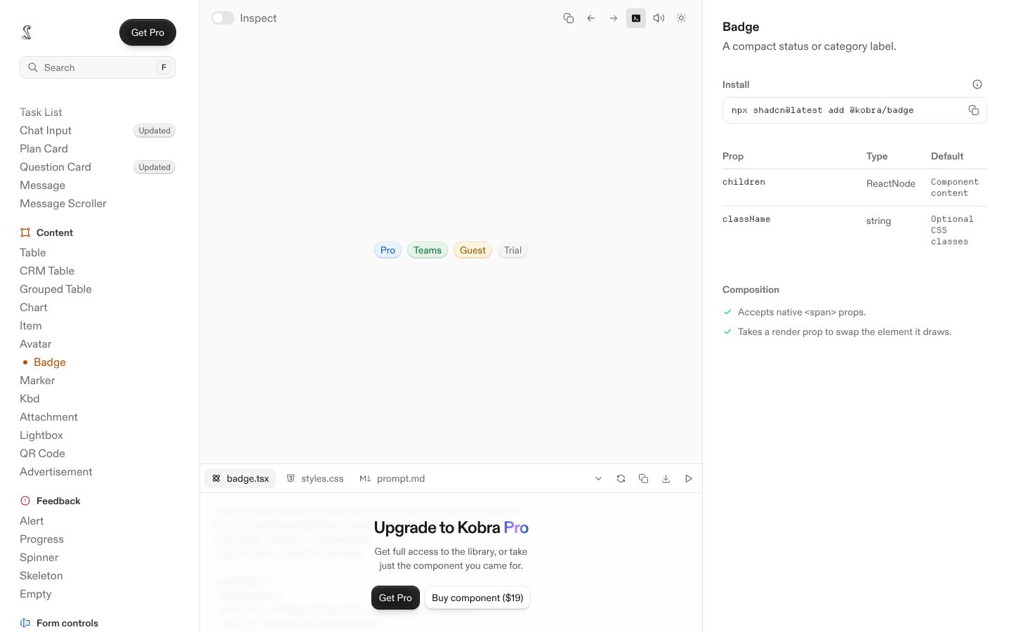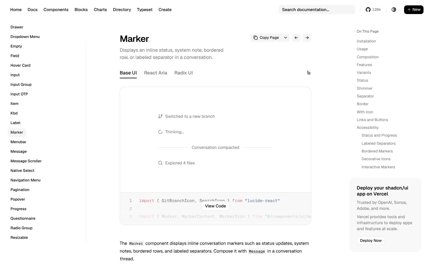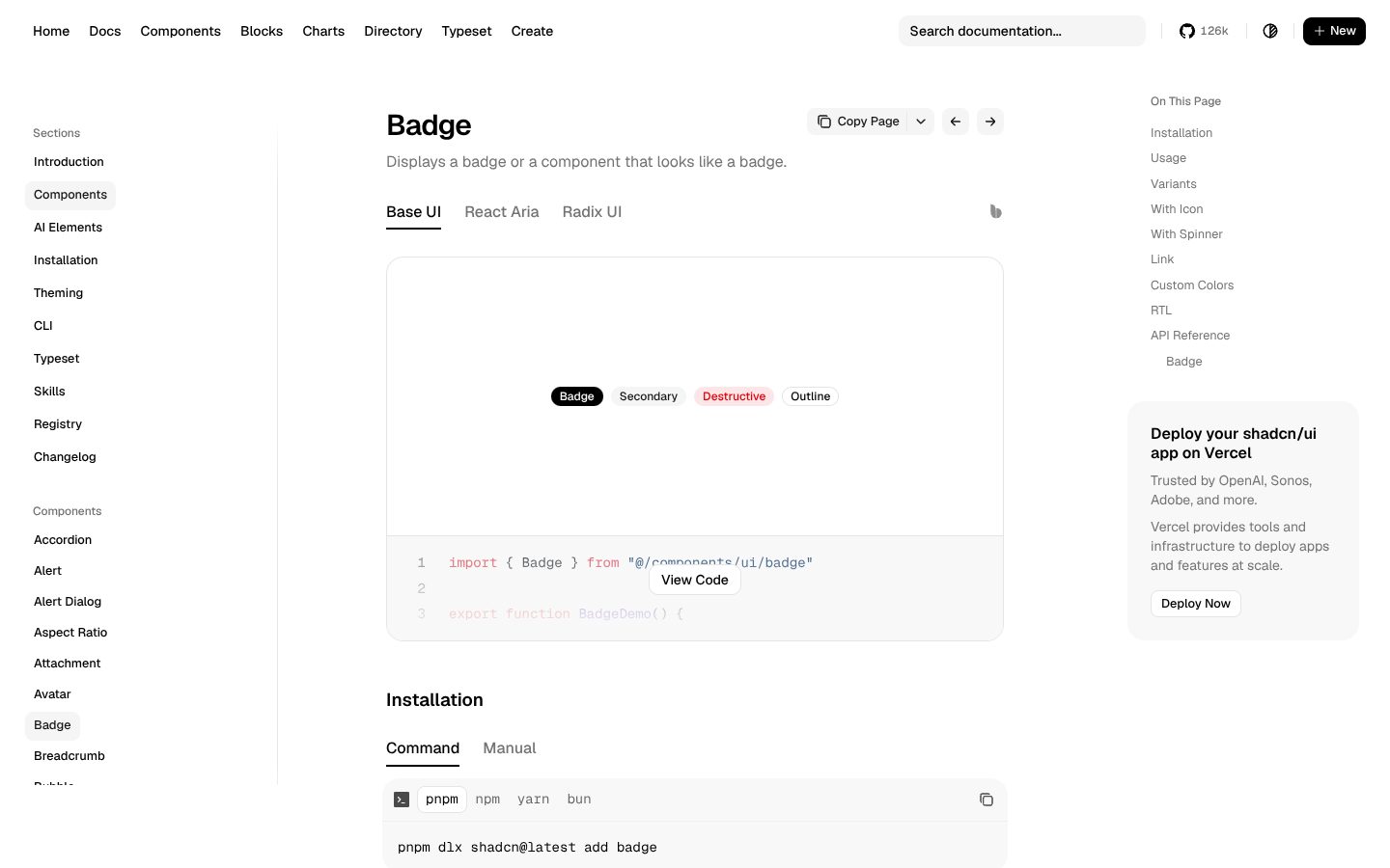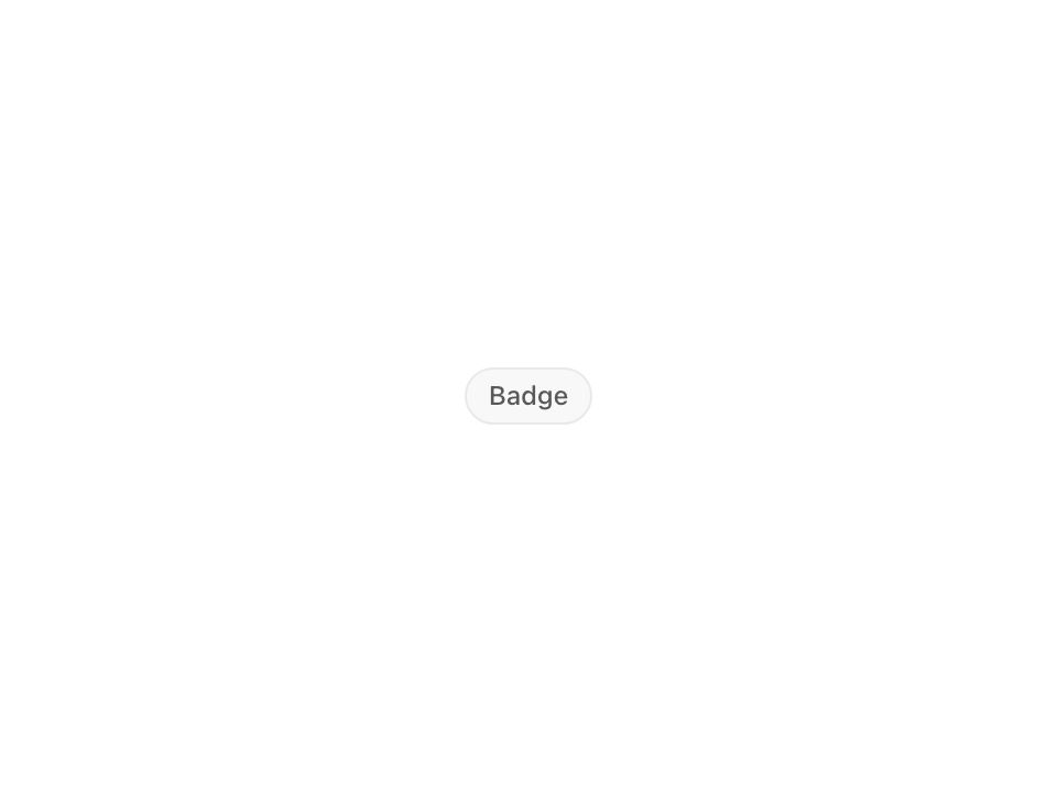
Live component. Click, hover, and type to try it.
Install
npx shadcn@latest add https://uiarc.dev/r/badge.jsonAbout
A small label for status, category, or metadata.
Live component. Click, hover, and type to try it.
npx shadcn@latest add https://uiarc.dev/r/badge.jsonA small label for status, category, or metadata.
"use client";

import { isValidElement, useEffect, useLayoutEffect, useRef } from "react";
import type { HTMLAttributes, ReactNode } from "react";
import { AnimatePresence, animate, motion, useIsPresent, useMotionValue, useReducedMotion, type AnimationPlaybackControls, type HTMLMotionProps, type TargetAndTransition, type Transition } from "motion/react";
import { motionTokens } from "../lib/motion-tokens";
import styles from "./badge.module.css";

export type BadgeTone = "neutral" | "success" | "info" | "warning" | "danger";
export type BadgeSize = "sm" | "md";

export interface BadgeProps extends HTMLAttributes<HTMLSpanElement> {
  tone?: BadgeTone;
  size?: BadgeSize;
  icon?: ReactNode;
}

const exitFast: Transition = { duration: motionTokens.duration.fast, ease: [...motionTokens.ease.standard] };
const textIn: TargetAndTransition = { opacity: 0, y: "0.3em", filter: `blur(${motionTokens.blur.soft}px)` };
const textOut: TargetAndTransition = { opacity: 0, y: "-0.3em", filter: `blur(${motionTokens.blur.subtle}px)`, transition: exitFast };
const iconIn: TargetAndTransition = { opacity: 0, scale: .6, filter: `blur(${motionTokens.blur.subtle}px)` };
const shown: TargetAndTransition = { opacity: 1, y: "0em", scale: 1, filter: "blur(0px)" };
const fadeOnly: TargetAndTransition = { opacity: 0, transition: { duration: motionTokens.duration.instant } };

/** Outgoing copies are hidden from assistive tech while they fade, so only the current text is read. */
function Swap(props: HTMLMotionProps<"span">) {
  const present = useIsPresent();
  return <motion.span {...props} aria-hidden={present ? props["aria-hidden"] : true} />;
}

/** A new icon component crossfades in; re-rendering the same icon stays still. */
function iconKey(icon: ReactNode) {
  if (!isValidElement(icon)) return "icon";
  const type = icon.type as string | { displayName?: string; name?: string };
  return typeof type === "string" ? type : type.displayName ?? type.name ?? "icon";
}

export function Badge({ tone = "neutral", size = "md", icon, className, children, ...props }: BadgeProps) {
  const reduce = useReducedMotion();
  const text = typeof children === "string" || typeof children === "number" ? String(children) : null;
  const glyphKey = icon ? iconKey(icon) : "";
  const body = useRef<HTMLSpanElement>(null);
  const content = useRef<HTMLSpanElement>(null);
  // Width stays auto at rest. Only a new label or icon springs it from the old size to the new one; passive reflows (a font swap, a hidden parent) follow instantly.
  const width = useMotionValue<number | "auto">("auto");
  const changedAt = useRef(0);
  useLayoutEffect(() => { changedAt.current = performance.now(); }, [text, glyphKey]);
  useEffect(() => {
    const node = content.current;
    if (!node || typeof ResizeObserver === "undefined") return;
    let last: number | undefined;
    let controls: AnimationPlaybackControls | undefined;
    const settle = () => { width.jump("auto"); if (body.current) body.current.style.width = "auto"; };
    const observer = new ResizeObserver(([entry]) => {
      if (!entry) return;
      const next = entry.borderBoxSize?.[0]?.inlineSize ?? node.offsetWidth;
      const current = width.get();
      const from = typeof current === "number" ? current : last;
      last = next;
      controls?.stop();
      if (reduce || from === undefined || from === next || performance.now() - changedAt.current > 120) return settle();
      // Pin the old width before this frame paints, then spring to the new one.
      if (body.current) body.current.style.width = `${from}px`;
      controls = animate(width, [from, next], { ...motionTokens.spring.morph, onComplete: settle });
    });
    observer.observe(node);
    return () => { observer.disconnect(); controls?.stop(); };
  }, [width, reduce]);
  const enter: Transition = reduce ? { duration: motionTokens.duration.instant } : { duration: motionTokens.duration.standard, ease: [...motionTokens.ease.enter] };
  const classes = [styles.badge, styles[tone], styles[size], className].filter(Boolean).join(" ");
  // The pill follows its content: text and icon swap in place while the width springs to the new size.
  return <span {...props} className={classes}>
    <motion.span ref={body} className={styles.body} style={{ width }}>
      <span ref={content} className={styles.content}>
        {icon ? <span className={styles.icon} aria-hidden="true"><AnimatePresence mode="popLayout" initial={false}><Swap key={glyphKey} className={styles.glyph} initial={reduce ? { opacity: 0 } : iconIn} animate={shown} exit={reduce ? fadeOnly : { ...iconIn, transition: exitFast }} transition={reduce ? enter : motionTokens.spring.snappy}>{icon}</Swap></AnimatePresence></span> : null}
        {text === null ? children : <span className={styles.label}><AnimatePresence mode="popLayout" initial={false}><Swap key={text} className={styles.text} initial={reduce ? { opacity: 0 } : textIn} animate={shown} exit={reduce ? fadeOnly : textOut} transition={enter}>{text}</Swap></AnimatePresence></span>}
      </span>
    </motion.span>
  </span>;
}

export default Badge;