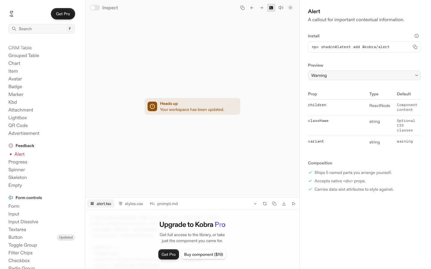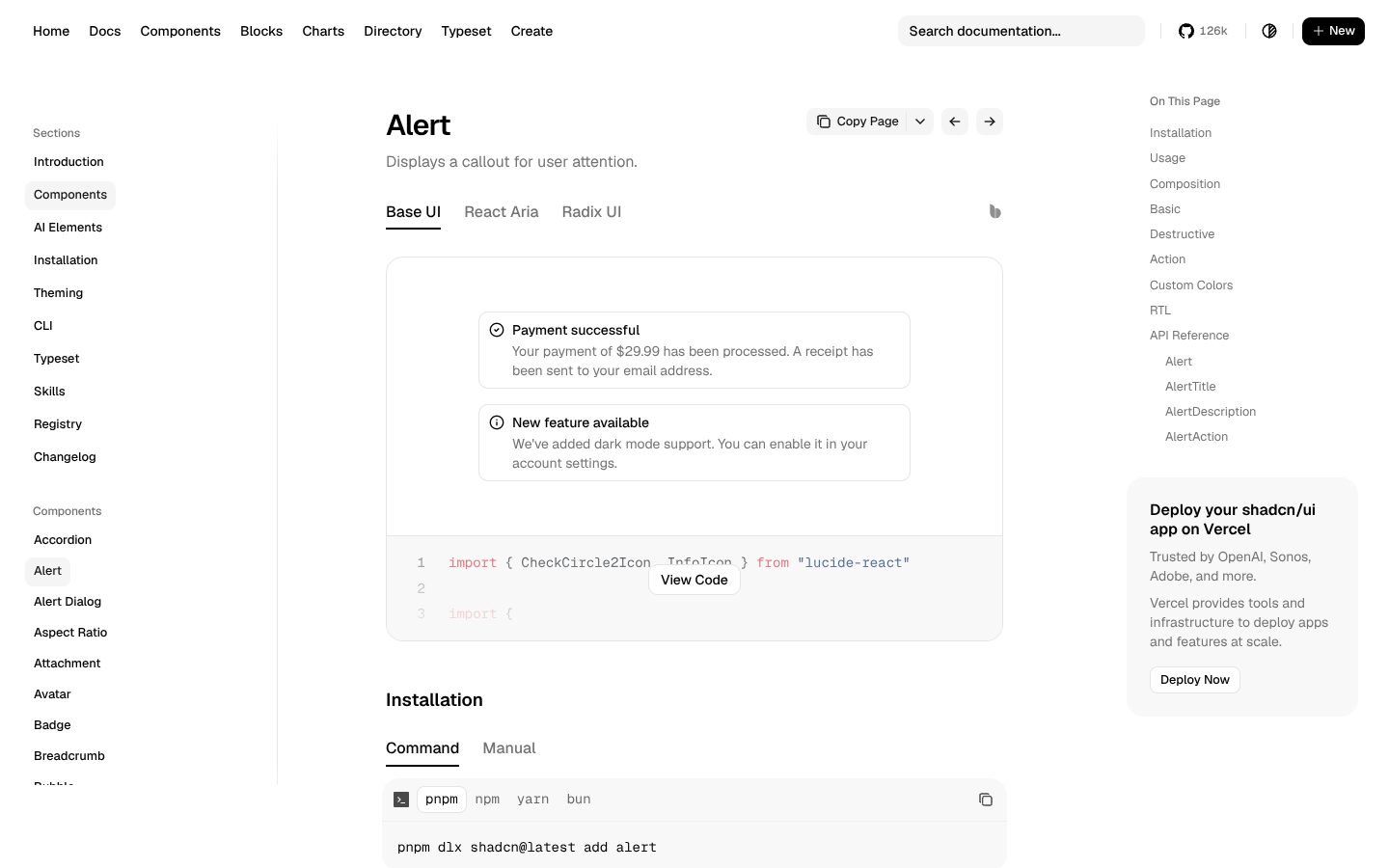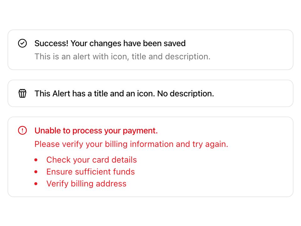
Live component. Click, hover, and type to try it.
Install
npx shadcn@latest add https://uiarc.dev/r/alert.jsonAbout
A persistent message that helps people recover or continue.
Live component. Click, hover, and type to try it.
npx shadcn@latest add https://uiarc.dev/r/alert.jsonA persistent message that helps people recover or continue.
"use client";

import { useEffect, useLayoutEffect, useRef, useState } from "react";
import type { HTMLAttributes, ReactNode } from "react";
import { AnimatePresence, animate, motion, useIsPresent, useMotionValue, useReducedMotion, type AnimationPlaybackControls, type HTMLMotionProps, type MotionProps, type TargetAndTransition, type Transition } from "motion/react";
import { Check, Info as InfoCircle, TriangleAlert as WarningTriangle, CircleX as XmarkCircle, X } from "lucide-react";
import { motionTokens } from "../lib/motion-tokens";
import styles from "./alert.module.css";

export type AlertTone = "info" | "success" | "warning" | "danger";
export interface AlertProps extends HTMLAttributes<HTMLDivElement> {
  tone?: AlertTone;
  title: string;
  children?: ReactNode;
  /** Controls presence. Hiding the alert collapses its height and fades it out. */
  open?: boolean;
  /** Shows a dismiss button. An uncontrolled alert collapses first, then calls this. */
  onDismiss?: () => void;
}
type AlertBoxProps = Omit<AlertProps, "open"> & { reduce: boolean | null; animateIcon?: boolean };

const icons = { info: InfoCircle, success: Check, warning: WarningTriangle, danger: XmarkCircle };
const exitFast: Transition = { duration: motionTokens.duration.fast, ease: [...motionTokens.ease.standard] };
const textIn: TargetAndTransition = { opacity: 0, y: "0.3em", filter: `blur(${motionTokens.blur.soft}px)` };
const textOut: TargetAndTransition = { opacity: 0, y: "-0.3em", filter: `blur(${motionTokens.blur.subtle}px)`, transition: exitFast };
const iconIn: TargetAndTransition = { opacity: 0, scale: .6, filter: `blur(${motionTokens.blur.subtle}px)` };
const shown: TargetAndTransition = { opacity: 1, y: "0em", scale: 1, filter: "blur(0px)" };
const fadeOut: TargetAndTransition = { opacity: 0, transition: { duration: motionTokens.duration.instant } };

/** Outgoing copies are hidden from assistive tech while they fade, so the live region reads only the current text. */
function Swap(props: HTMLMotionProps<"span">) {
  const present = useIsPresent();
  return <motion.span {...props} aria-hidden={present ? props["aria-hidden"] : true} />;
}

/** Follows its content height. After `morphKey` changes, the height springs from the old size to the new one and then returns to auto, so passive reflows (a resize, a font swap) follow instantly. It clips only while moving, so focus rings stay visible at rest. */
function HeightFrame({ className, reduce, morphKey, children }: { className?: string; reduce: boolean | null; morphKey: string; children: ReactNode }) {
  const frame = useRef<HTMLDivElement>(null);
  const content = useRef<HTMLDivElement>(null);
  const height = useMotionValue<number | "auto">("auto");
  const changedAt = useRef(0);
  useLayoutEffect(() => { changedAt.current = performance.now(); }, [morphKey]);
  useEffect(() => {
    const node = content.current;
    if (!node || typeof ResizeObserver === "undefined") return;
    let last: number | undefined;
    let controls: AnimationPlaybackControls | undefined;
    const settle = () => { height.jump("auto"); if (frame.current) Object.assign(frame.current.style, { overflow: "", height: "auto" }); };
    const observer = new ResizeObserver(([entry]) => {
      if (!entry) return;
      const next = entry.borderBoxSize?.[0]?.blockSize ?? node.offsetHeight;
      const current = height.get();
      const from = typeof current === "number" ? current : last;
      last = next;
      controls?.stop();
      if (reduce || from === undefined || from === next || performance.now() - changedAt.current > 120) return settle();
      // Pin the old height before this frame paints, then spring to the new one.
      if (frame.current) Object.assign(frame.current.style, { overflow: "hidden", height: `${from}px` });
      controls = animate(height, [from, next], { ...motionTokens.spring.smooth, onComplete: settle });
    });
    observer.observe(node);
    return () => { observer.disconnect(); controls?.stop(); };
  }, [height, reduce]);
  return <motion.div ref={frame} className={className} style={{ height }}>
    <div ref={content} className={styles.content}>{children}</div>
  </motion.div>;
}

function AlertBox({ tone = "info", title, children, className, reduce, onDismiss, animateIcon = false, ...props }: AlertBoxProps) {
  const Icon = icons[tone];
  const text = typeof children === "string" || typeof children === "number" ? String(children) : null;
  const hasDetails = children !== undefined && children !== null && children !== false && children !== "";
  const enter: Transition = reduce ? { duration: motionTokens.duration.instant } : { duration: motionTokens.duration.standard, ease: [...motionTokens.ease.enter] };
  const swap: MotionProps = { initial: reduce ? { opacity: 0 } : textIn, animate: shown, exit: reduce ? fadeOut : textOut, transition: enter };
  return <div {...props} className={[styles.alert, styles[tone], className].filter(Boolean).join(" ")} role={tone === "danger" ? "alert" : "status"}>
    {/* A new tone morphs its icon in place; a newly shown alert gives the icon a small settle. */}
    <motion.span className={styles.icon} initial={animateIcon && !reduce ? iconIn : false} animate={shown} transition={motionTokens.spring.snappy}>
      <AnimatePresence mode="popLayout" initial={false}><Swap key={tone} className={styles.glyph} initial={reduce ? { opacity: 0 } : iconIn} animate={shown} exit={reduce ? fadeOut : { ...iconIn, transition: exitFast }} transition={reduce ? enter : motionTokens.spring.snappy}><Icon width={18} height={18} aria-hidden="true"/></Swap></AnimatePresence>
    </motion.span>
    {/* The copy column follows its content height, so longer or shorter messages never snap the alert. */}
    <HeightFrame className={styles.copy} reduce={reduce} morphKey={`${title}\n${hasDetails}\n${text ?? ""}`}>
      <strong className={styles.title}><AnimatePresence mode="popLayout" initial={false}><Swap key={title} className={styles.line} {...swap}>{title}</Swap></AnimatePresence></strong>
      <AnimatePresence mode="popLayout" initial={false}>{hasDetails && <motion.p key="details" className={styles.description} {...swap}>
        {text === null ? children : <AnimatePresence mode="popLayout" initial={false}><Swap key={text} className={styles.line} {...swap}>{text}</Swap></AnimatePresence>}
      </motion.p>}</AnimatePresence>
    </HeightFrame>
    {onDismiss && <button type="button" className={styles.dismiss} aria-label={`Dismiss: ${title}`} onClick={onDismiss}><X width={16} height={16} strokeWidth={1.75} aria-hidden="true"/></button>}
  </div>;
}

export function Alert({ open, onDismiss, ...props }: AlertProps) {
  const reduce = useReducedMotion();
  const [dismissed, setDismissed] = useState(false);
  const shell = useRef<HTMLDivElement>(null);
  const setClip = (value: string) => { if (shell.current) shell.current.style.overflow = value; };
  if (open === undefined && !onDismiss) return <AlertBox {...props} reduce={reduce}/>;
  const isOpen = open ?? !dismissed;
  const dismiss = onDismiss && (() => open === undefined ? setDismissed(true) : onDismiss());
  const presence: Transition = reduce ? { duration: 0 } : { height: motionTokens.spring.smooth, opacity: { duration: motionTokens.duration.standard, ease: [...motionTokens.ease.enter] } };
  const exit: TargetAndTransition = { height: 0, opacity: 0, transition: reduce ? { duration: 0 } : { height: motionTokens.spring.smooth, opacity: exitFast } };
  // Presence collapses the height with the fade, so the content below closes the gap instead of jumping.
  return <AnimatePresence initial={false} onExitComplete={() => { if (open === undefined) onDismiss?.(); }}>
    {isOpen && <motion.div key="alert" className={styles.presence} initial={{ height: 0, opacity: 0 }} animate={{ height: "auto", opacity: 1 }} exit={exit} transition={presence} ref={shell} onAnimationStart={() => setClip("hidden")} onAnimationComplete={() => setClip("")}>
      <AlertBox {...props} reduce={reduce} onDismiss={dismiss} animateIcon/>
    </motion.div>}
  </AnimatePresence>;
}

export default Alert;