Hexagon BackgroundNew
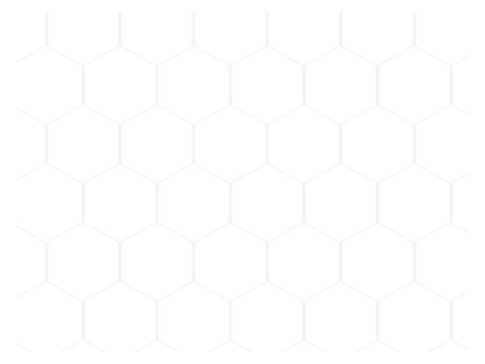
Live component. Click, hover, and type to try it.
Install
npx shadcn@latest add https://animate-ui.com/r/backgrounds-hexagon.jsonAbout
A background component featuring an interactive hexagon grid.
Live component. Click, hover, and type to try it.
npx shadcn@latest add https://animate-ui.com/r/backgrounds-hexagon.jsonA background component featuring an interactive hexagon grid.
'use client';

import * as React from 'react';

import { cn } from 'cn';

const range = (length: number) => Array.from({ length }, (_, i) => i);

type HexagonBackgroundProps = React.ComponentProps<'div'> & {
  hexagonProps?: React.ComponentProps<'div'>;
  hexagonSize?: number;
  hexagonMargin?: number;
};

function HexagonBackground({
  ref,
  className,
  children,
  hexagonProps,
  hexagonSize = 75,
  hexagonMargin = 3,
  ...props
}: HexagonBackgroundProps) {
  const hexagonWidth = hexagonSize;
  const hexagonHeight = hexagonSize * 1.1;
  const rowSpacing = hexagonSize * 0.8;
  const baseMarginTop = -36 - 0.275 * (hexagonSize - 100);
  const computedMarginTop = baseMarginTop + hexagonMargin;
  const oddRowMarginLeft = -(hexagonSize / 2);
  const evenRowMarginLeft = hexagonMargin / 2;

  const containerRef = React.useRef<HTMLDivElement>(null);
  React.useImperativeHandle(ref, () => containerRef.current as HTMLDivElement);

  const [gridDimensions, setGridDimensions] = React.useState({
    rows: 0,
    columns: 0,
  });

  React.useLayoutEffect(() => {
    const container = containerRef.current;
    if (!container) return;
    const update = () => {
      const { width, height } = container.getBoundingClientRect();
      const rows = Math.ceil(height / rowSpacing) + 1;
      const columns = Math.ceil(width / hexagonWidth) + 1;
      setGridDimensions((prev) =>
        prev.rows === rows && prev.columns === columns
          ? prev
          : { rows, columns },
      );
    };
    update();
    const resizeObserver = new ResizeObserver(update);
    resizeObserver.observe(container);
    return () => resizeObserver.disconnect();
  }, [rowSpacing, hexagonWidth]);

  return (
    <div
      ref={containerRef}
      data-slot="hexagon-background"
      className={cn(
        'relative isolate size-full overflow-hidden dark:bg-neutral-900 bg-neutral-100',
        className,
      )}
      {...props}
      style={
        {
          '--hexagon-margin': `${hexagonMargin}px`,
          ...props.style,
        } as React.CSSProperties
      }
    >
      <div
        aria-hidden="true"
        className="absolute top-0 left-0 -z-10 size-full overflow-hidden text-base leading-6"
      >
        {range(gridDimensions.rows).map((rowIndex) => (
          <div
            key={rowIndex}
            style={{
              marginTop: computedMarginTop,
              marginLeft:
                ((rowIndex + 1) % 2 === 0
                  ? evenRowMarginLeft
                  : oddRowMarginLeft) - 10,
            }}
            className="inline-flex"
          >
            {range(gridDimensions.columns).map((colIndex) => (
              <div
                key={colIndex}
                {...hexagonProps}
                style={{
                  width: hexagonWidth,
                  height: hexagonHeight,
                  marginLeft: hexagonMargin,
                  ...hexagonProps?.style,
                }}
                className={cn(
                  'relative',
                  '[clip-path:polygon(50%_0%,_100%_25%,_100%_75%,_50%_100%,_0%_75%,_0%_25%)]',
                  "before:content-[''] before:absolute before:top-0 before:left-0 before:w-full before:h-full dark:before:bg-neutral-950 before:bg-white before:opacity-100 before:transition-colors before:duration-1000",
                  "after:content-[''] after:absolute after:inset-[var(--hexagon-margin)] dark:after:bg-neutral-950 after:bg-white",
                  'after:[clip-path:polygon(50%_0%,_100%_25%,_100%_75%,_50%_100%,_0%_75%,_0%_25%)]',
                  'hover:before:bg-neutral-200 dark:hover:before:bg-neutral-800 hover:before:opacity-100 hover:before:duration-0 dark:hover:after:bg-neutral-900 hover:after:bg-neutral-100 hover:after:opacity-100 hover:after:duration-0',
                  hexagonProps?.className,
                )}
              />
            ))}
          </div>
        ))}
      </div>
      {children}
    </div>
  );
}

export { HexagonBackground, type HexagonBackgroundProps };